Welcome to my artist’s newsletter #2, I’m delighted you’re reading this. Let’s start with…
Results
A Breakthrough! The last month, I’ve been reflecting, writing, researching, and experimenting. In doing so, I’ve found the key to unlocking a creative block I’ve combated for 30+ years! I’ve never had any problems with photography, but I’ve had decades of struggle with painting, and with my identity as an artist. Combining photography and painting, is proving to be the answer. The outcome is that I’m motivated, feeling very positive and possibility-minded, and have been immersed in creative action. I’ve also been blogging like wildfire, as you’ll see below.
News
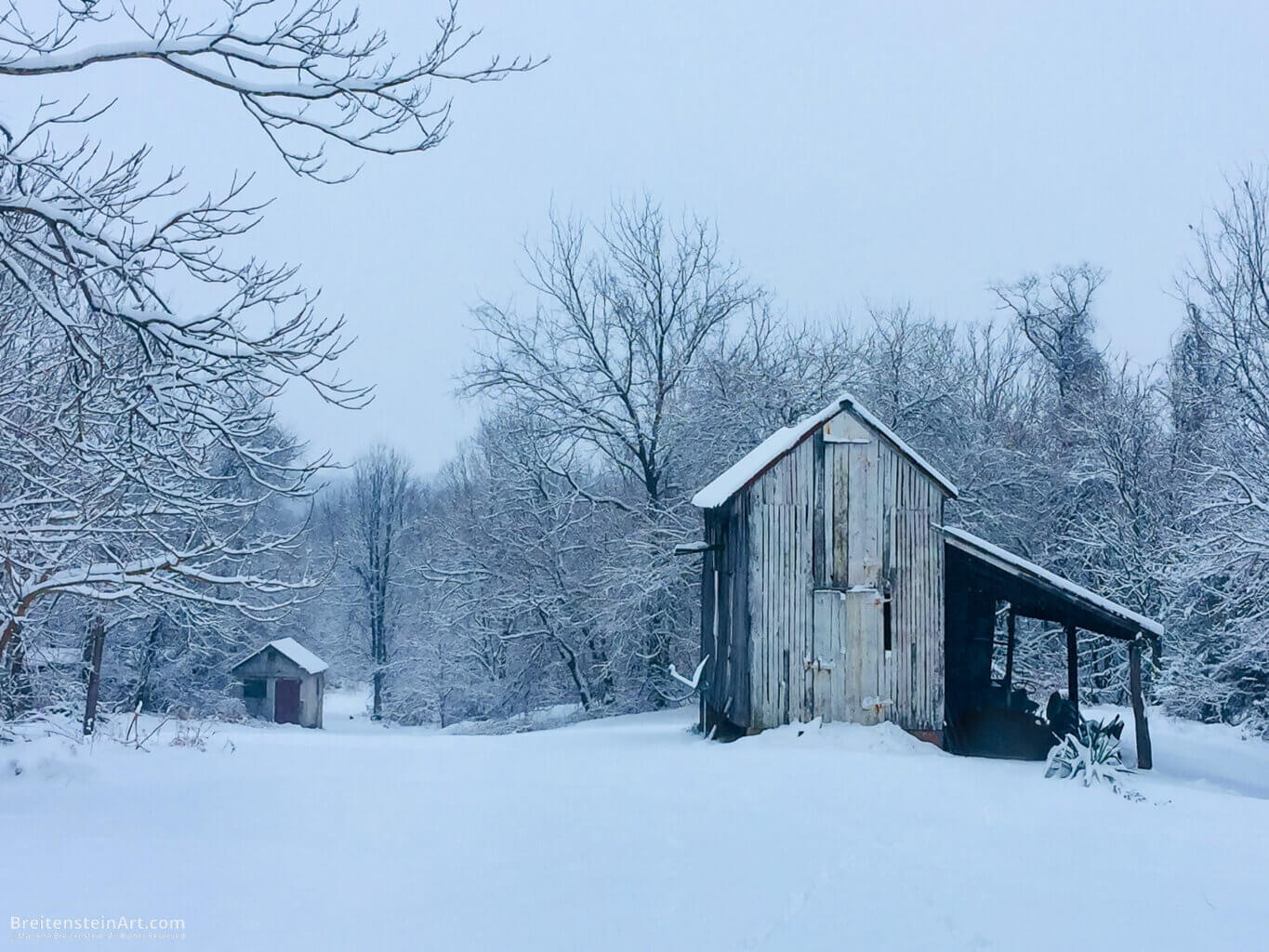
Featured! I’m delighted that an image of mine was featured in an article highlighting rural photos, by Glass! In my related blog post, I dive into why rural is important to me, share a few more of my submissions, plus 18 terrific photos by other Glass photographers. Take a look.
Wallpaper for your desktop or tablet.Download three wallpapers at the web version of this newsletter (fits screens up to 2560 wide). [This is a benefit for people who’ve signed up for my artist updates. I invite you to sign up, too! Learn more here.]
Inspiration
Mentors. Since 2020, I’ve had an informal mentor in the wonderfully thoughtful and brilliant Edo Amin. Now, I have a second mentor, a professional photographer who I’ve become acquainted with online. I am so thankful! If you’re considering finding a mentor (multiple mentors are recommended):
Interact with more with people you look up to, in-person or online. A casual mentor is likely to appear.
Challenges
Thoughts on Copyright Protection — I am concerned about art theft. Here, I discuss types of copyright, intellectual property rights and protection, as well as infringement and enforcement, with pointers to helpful resources. (This blog post got a thumbs up from a copyright lawyer.) Read more.
Shutter Happy: A Tale of Too Many Photographs — We’ve been traveling a lot, which led to this post. How does one balance the easy creation of photos, with the reality of sorting, storing and processing them? Get some tips. Read more.
Techniques
I’ve been quite busy conducting tests and blogging about…
Experimenting with Painting on Photos
Part 1 — Where I explore professional printing services, fine art papers, painting methods, supplies, and execute my first little experiment … which was a complete failure.
Part 2 — Next, I devise a plan, and share my second set of experiments. The process was very informative.
Part 3 — Experience experiment frustration with me, learn some fun personal info, and harvest all the takeaways, without all the hassle.
I Appreciate You!
Thanks for reading. Feel free to reply to this email with questions or comments. It’s great that you let me keep in touch with you!
Moving right along, I’m ready for the next stage of experimenting. (If you haven’t read them, here’s Part One and Part Two of this process.)
Today, I’ll be applying a clear gesso on photographs, to gauge its transparency. Next, I’ll see how the gesso behaves with soft pastels. Finally, I’ll learn what happens when I texture the gesso with a heat gun.
I’m continuing with the five Hahnemühle Giclée photo samples I procured from White Wall: Baryta, FineArt Pearl, Torchon, Photo Rag and William Turner. Further, I cut a square corner out of my much thinner UltraHD glossy sample print, to test as well. How will it hold up to heat?
Experiment Plan for Painting on Photos
As a refresher, here’s the overall plan. I’ve already completed steps one through three.
Direct dry pastel application in five layers, from hardest to softest pastels.
Another direct application in five layers, using only the softest pastels.
Applying the softest pastel layers with fixative, for a little tooth.
Applying Winsor & Newton Artists’ Acrylic Clear Gesso smoothly, to gauge effect alone.
Testing the gesso with layers of pastels.
Applying the gesso with the heat gun, to create texture.
Testing the textured gesso with pastels.
Layering gesso and pastels, with fixative.
What happens if I finish the painting with a layer of gesso?
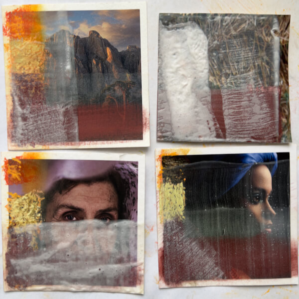
#4: Experimenting with Applying Clear Gesso to the Photos
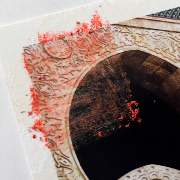
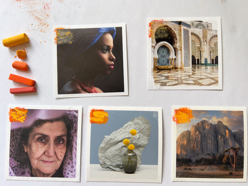
Previously, I read about a number of top brand “clear” and “transparent” gessoes, and settled on Winsor & Newton Artists’ Acrylic Clear Gesso. On its promotional material and the product label itself, W&N states this gesso is “completely clear when dry.” Naturally, transparency is important to me, so the photo shows through the gesso with minimal change.
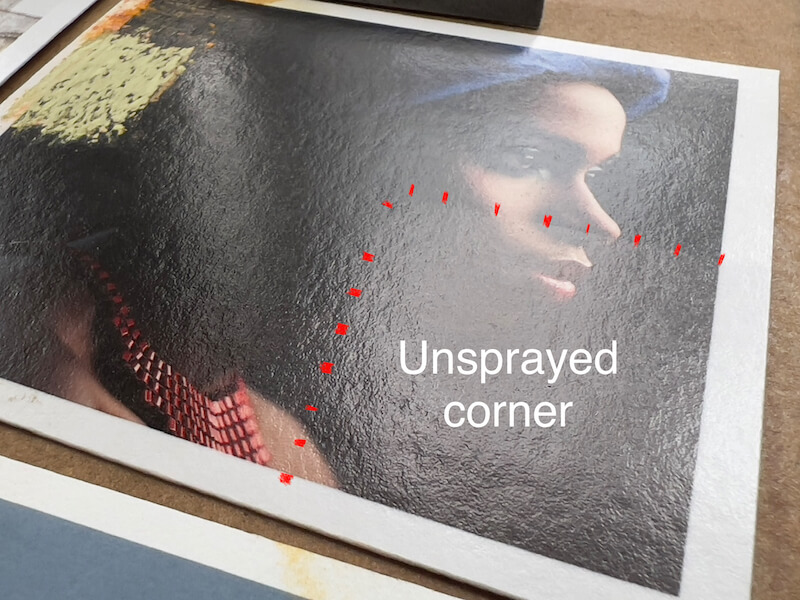
However, concerned that the sample Giclée prints might be damaged by applying a wet medium, I decided to spray them with the Schmincke pastel fixative first. As a “control,” I left a corner of each unsprayed to see if it reacted poorly. (Granted, the fixative is wet too, but it’s not being applied with a brush that could push pigment around.)
Wet
Here’s how the gesso looks, shortly after being applied:
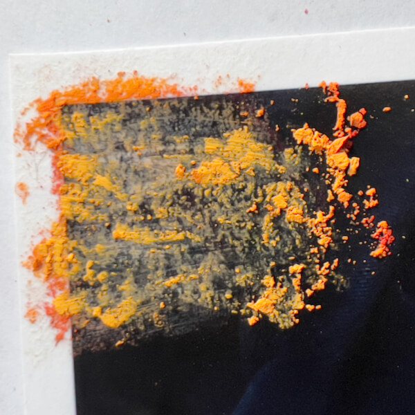
Photo Rag with wet gesso.
FineArt Pearl with wet gesso.
Torchon with wet gesso.
William Turner with wet gesso.
UltraHD with wet gesso.
Baryta with wet gesso.
Dry
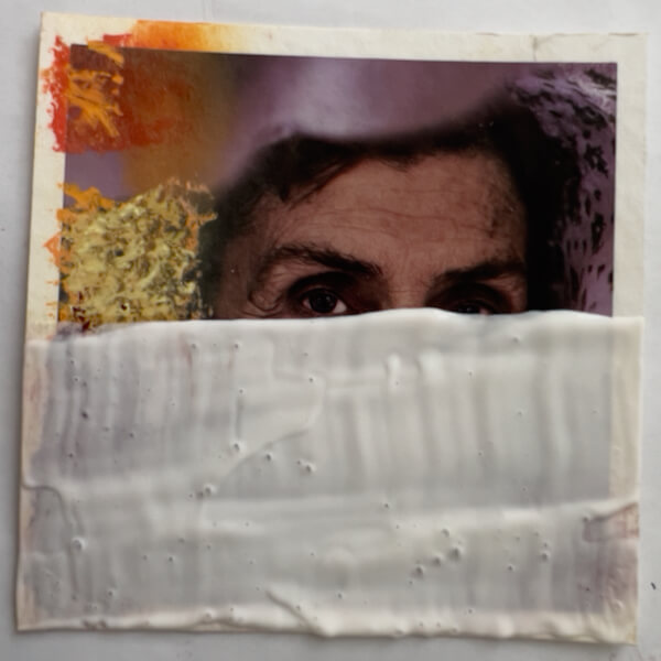
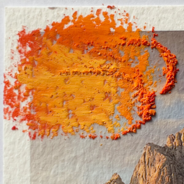
AARGH! Here’s how the gesso appears, after drying overnight. Needless to say, I’m not terribly happy with four of the six results.
As you can see, Winsor & Newton’s repeated claim of “completely clear when dry” isn’t quite accurate.
Takeaways
On the plus side, the W&N Clear Gesso creates a toothy, matte finish, which should be great for grabbing and holding numerous layers of chalk pastels. In this regard, I am positively impressed. No need to mix marble dust or pumice into a wet medium for tooth.
Because the gesso is matte, all sheens from the glossy surfaces are obscured, rendering them rather pointless when being painted over.
Fortunately, contrary to how regular ink jet prints bleed and smear when wet (Giclée is a form of ink jet), none of the photographs tested appear to have blurred from the application of the gesso.
Ranking the Papers by Gesso Clarity
The Winners
Photo Rag, gesso dry. See big Best for painting on moodier, shadier, or lower-light photos.
FineArt Pearl, gesso dry. See big Best for painting on photos that benefit from an inner glow.
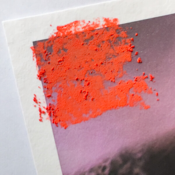
Perhaps the best result of gesso clarity is on the Hahnemühle PhotoRag, an already matte paper, with the smoothest of the matte surfaces in this trial. Luckily, I was already favoring this paper for its relative lack of texture, so I’m really happy that the gesso is nearly clear when applied in a thin layer, only every so slightly darkening and dulling the photograph. Further, if I want to leave parts of a photograph completely untouched, this would be the least noticeable transition between gesso and pure print. The paper itself is not as bright as others, so this should work best for moodier, shadier, or lower-light photographs+paint applications.
Interestingly, when painted with the W&N Clear Gesso, the Hahnemühle FineArt Pearl retains its merit. The gesso is pretty translucent, with just a hint of dulling, and cloudiness in the darks. While it obscures the surface refraction of the pearlescent finish, the print still looks quite good, with an inner glow. I will also be using this paper for painting on photos, since it’s a great choice when the photograph would benefit from a feeling of refractive light.
The Rest
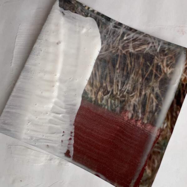
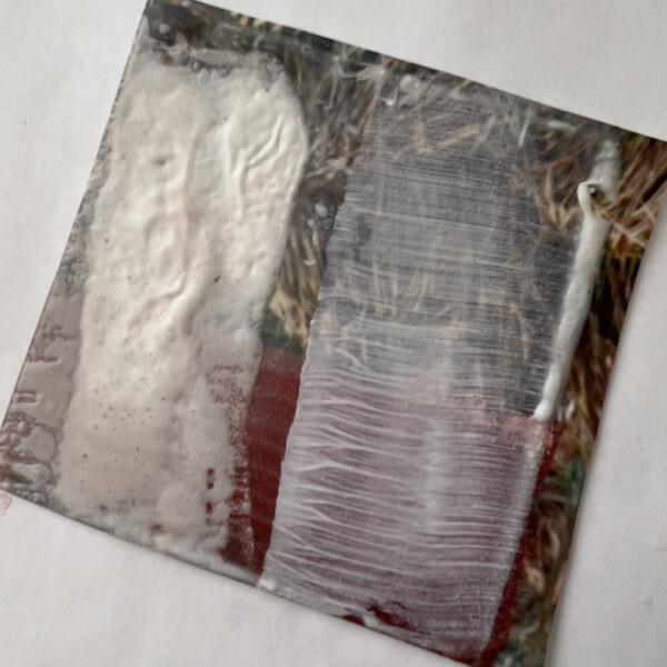
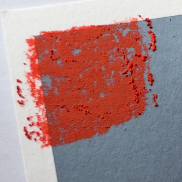
Next in line is the Hahnemühle Torchon, which didn’t take the gesso badly, but it looks a bit dull and milky, despite the already matte print.
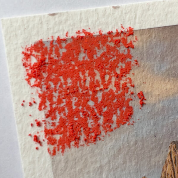
In this test, it was a tie for the next worst performance of the W&N Clear Gesso. Sadly, the printed image on the William Turner was markedly dulled and obscured by the gesso. Similarly, the UltraHD glossy was muted, and unsurprisingly, for its cost and sharpness, using gesso on it seems a waste. (These two papers and printing methods are really gorgeous, so I’ll also save them for straight-up photo prints that won’t be painted on.)
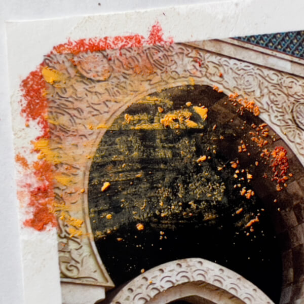
Regrettably, the gesso performed the worst on the Hahnemühle Baryta, looking the milkiest against the largely dark image. (Would it look similarly cloudy on the other papers, if their images were as dark? Perhaps.) While I won’t use this paper for painting on photos, it’s a lovely paper for dark photographic prints.
Can I Make the Gesso Clearer?
Disappointed that gesso on the Baryta is so milky, I wondered if that would reduce if sanded. Therefore, I filled the sandpaper block with 120 grit paper and sanded a little. First, I tried brushing away the residue. Next, I tried moist-wiping away the residue.
Um, NO, definitely doesn’t help. I suspect a finer grit wouldn’t, either. Why did I think this would work?
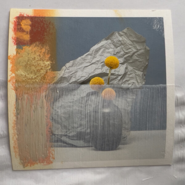
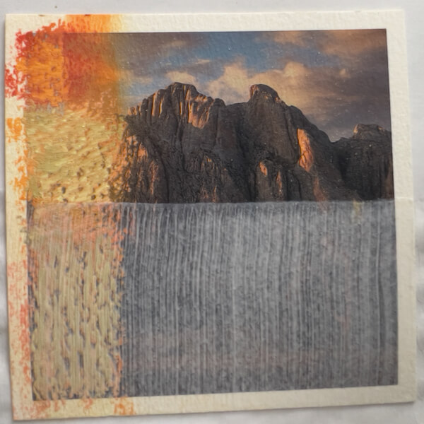
Gesso sanded in two small patches (middle right).
#5: Testing Gesso with Pastels
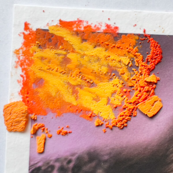
Moving on, I applied five layers of Schmincke pastels, the softest soft pastel, with no fixative between. Here’s how it looked on one of the samples:
Five layers of Schmincke, the softest pastel, on the gesso (lower left from red to pink).
Unfortunately, with no fixative, the fifth layer started smearing.
Takeaways
The gesso could only take 4 pastel layers.
I won’t bother testing with fixative, surely that will work as before.
#6: Gesso + Heat Gun = Texture
Now for the trickiest test! I’ve never used a heat gun; this will be interesting. (Don’t try this at home, kids! I’m just blogging about this for my own reference later. Not responsible for the injury of others, etc., etc., yadda, yadda.)
Heat Gun Method
Looking back at Cory Goulet’s instructions, her recommendation for creating texture in the gesso is to (I paraphrase):
Pour a little gesso into a container. Using a wide brush, gently apply a smooth layer of gesso over the pastel, carefully as to not muddy the gesso or lift the pastel. (Only apply to a small section, and texturize it as described below, before moving on to another section.)
Keep in mind that the thicker the gesso layer, the more texture, but also the cloudier (Goulet was using Liquitex, but this seems true for Winsor & Newton too, alas).
Safetythirdfirst! Know how to operate your heat gun properly and carefully, before proceeding. Be sober. Avoid loose hair, clothing, curtains, and jewelry. DON’T TOUCH THE TIP OF THE GUN WITH ANYTHING!
Start with the heat gun on the lowest temperature setting, and the gesso just applied. Very slowly, sweep the gun over the gesso to texturize as desired (rippling, bubbling). Gradually adjust temperature setting and movement speed, if needed. (I ended up using a higher temperature.)
When done, cool the heat gun, and cool and fully dry the gesso before adding pastels.
Flatten buckled paper under a weight, if necessary.
See Goulet’s article, linked above, for more details.
Experimentation Hesitation
Naturally—being the appointed family campfire-maker and fireplace-tender in my youth, then graduating to being a fire dancer, I have an informed respect for heat and fire. (Crazily, I have singed my eyelashes, but not my eyebrows, doing a buzz saw with fire poi.)
Back to the experiments at hand, I proceed with caution.
Believe it or not, I’m a little nervous about using a heat gun. I must be doing something right.
“Do one thing every day that scares you.”
— Eleanor Roosevelt
This is how it turned out on the initial round. First, I learned that the lowest heat setting just dries the gesso without texturing it, even if I hold the heat gun still over an area of gesso. Same with heat level number 2. And number 3…
The UltraHD paper with a second layer of gesso, before the first heat gun test.
After the first heat gun test, on the lowest setting. No bubbling or rippling. (I marred the gesso by accident.)
Experimenting Success!
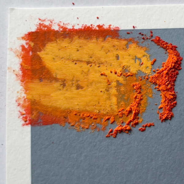
Finally, I turned the heat up to 4. Texturing occurred! However, that was a little too hot, so I lowered the setting to 3.5, which seems perfect for my heat gun.
Here’s the Torchon paper, with a second layer of gesso, before applying heat. Bubbles are from the brush.
… and the UltraHD paper, also before a heat gun test. Bubbles are from the brush.
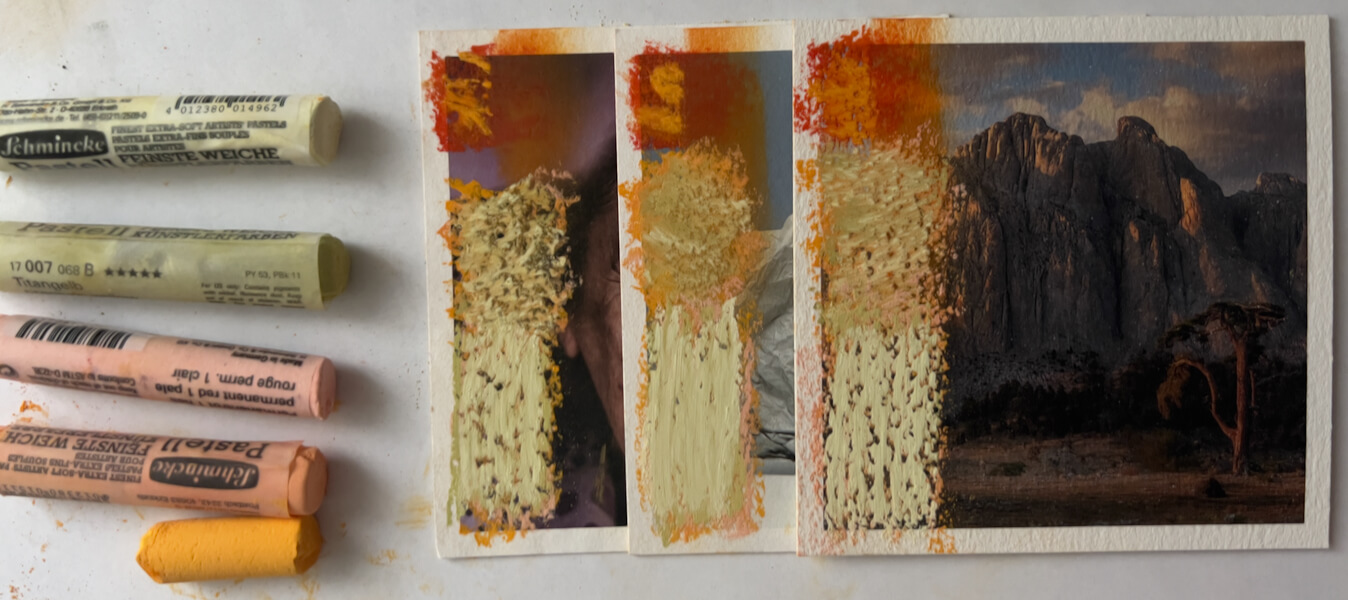
The UltraHD paper, after the higher heat on left, and with a new thin layer of gesso, right. See big
Four papers after the high heat test, with thick and thin gesso applications. See big
Takeaways
The bubbling and rippling from the gesso being heated is an interesting effect. Unfortunately, the gesso was made less clear by heating, where texturing formed. Oh, well.
This process is a lot slower than I anticipated. For some reason, I envisioned high-force blowing, like a hair dryer, or a torch lighter, but nope.
As phenomenal as they look, the UltraHD photo prints by White Wall are not great with heat. The emulsion can separate from the thin paper.
Fortunately, the Hahnemühle Baryta, Torchon and William Turner had no issue with the heat gun; no damage to the image and very minor paper buckling, due to the gesso’s wetness.
My Makita HG6031V heat gun should be set to 3.5 (out of 9 heat levels), to get the gesso to ripple and bubble.
Naturally, a thin application of gesso will bubble faster. Bubbles form along lines left by the brush.
If the brush has left bubbles, they don’t go away with heat. This is a plus, if desired.
Thick applications of gesso pool more, and ripple and bubble in random ways. Likewise, they are nearly impossible to see through, so should only be used in areas where transparency doesn’t matter.
Any indentations in the gesso are retained. Accordingly, experimenting with texture could be worthwhile. Try intentionally adding texture before applying heat, to introduce patterns, movement, focal points, etc.
This should go without saying, but don’t touch the gesso until you are certain it’s dry. Also, once dry, any bigger bubbles can deflate when pushed, so only touch with intention.
Reflection
After waking up the next morning, and having processed some of my emotions from these tests, I have to say I’m really quite disappointed with the overall lack of clarity with the gesso. I feel misled by Winsor & Newton. I was expecting something like a gel medium that dries clear, even when thickly applied. Expectations are dangerous, I know, but W&N set the bar high!
Further, I ordered the gesso directly from Winsor & Newton, so it would be fresh and authentic, to be certain I wasn’t getting an old or fake product. And, of course, thinking I’d be using it for a long time, I ordered the largest size offered, to “save money.”
Of course, I can’t blame the gesso for changing to a white color when heat is applied. That said, the fact that it’s not the “completely clear when dry” it says on the label is really false advertising, in my way of thinking. I may write them a letter to express my disappointment. Bah! Humbug!
Still, I’m really pleased with the fact that a thin coating on two of the papers worked well enough. Again, I’ve learned a lot from this round of experimenting.
What’s Next?
Fun! I’ll be with layering pastels and gesso, to see what painting on the surface is like, and to play more with texturing in a thoughtful, purposeful manner. Stay tuned for the last installment!
If you’re new to my blog, at this stage in my artistic development, I’m experimenting with painting on photos. Being both a photographer and painter, I want to combine these strengths! My preferred painting medium is soft (dry) pastels, which I plan to use over professional Giclée prints of my own photographs.
Unfortunately, pastel can be smudged unless placed under glass. I’d like to avoid that, since even expensive museum glass feels like a barrier to visual entry. Therefore, I will likely resort to using a wet medium in the process, to hold and bind the pastel, and perhaps as a final coat. We’ll see how that goes.
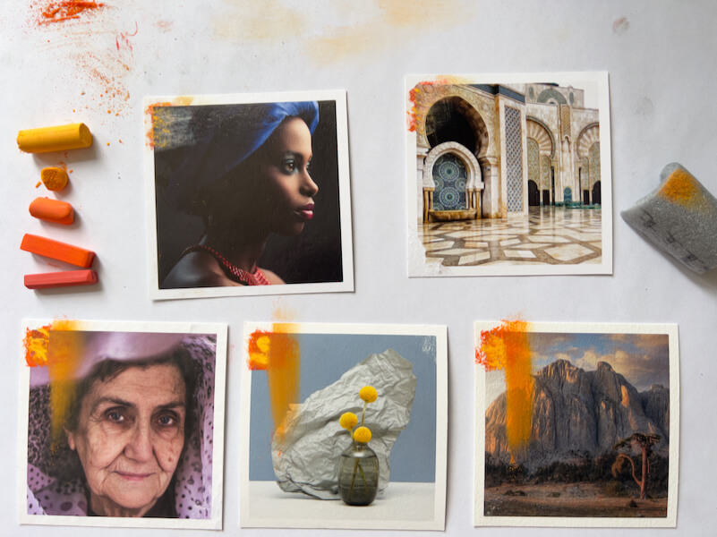
I’m experimenting on gorgeous photo samples that I ordered from the award-winning printer White Wall. They presently use five Hahnemühle papers: Baryta, FineArt Pearl, Torchon, Photo Rag and William Turner. Later I’ll move on to testing the aluminum surfaces I ordered, also from White Wall.
Recap of Part One
Earlier this week, I posted Part 1 of this process. There I discussed choosing White Wall, investigating paper surfaces, reviewing methods for painting on photos, and gathering supplies. Then I experimented with tape for masking, to see what would happen when I pulled each brand off the fine art prints. The results, with the tapes I tried, weren’t good.
That experiment done, next I needed to devise…
An Experiment Plan, for Painting on Photos
Yesterday, I nearly dove into applying pastel to one of the papers. However, I realized I’d better be strategic, or I’ll use up my small samples too quickly. Making the most of this opportunity calls for a thoughtful approach, to get comprehensive results.
My Plan
Based on the painting methods I’d reviewed (see Part 1), I decided to break my ideas for painting on photos into stages. I added steps as I went along, and this is my plan, so far:
Direct dry pastel application in five layers, from hardest to softest pastels.
Another direct application in five layers, using only the softest pastels.
Applying the softest pastel layers with fixative, for a little tooth.
Applying Winsor & Newton Artists’ Acrylic Clear Gesso smoothly, to gauge effect alone.
Testing the gesso with layers of pastels.
Applying the gesso with the heat gun, to create texture.
Testing the textured gesso with pastels.
Layering gesso and pastels, with fixative.
What happens if I finish the painting with a layer of gesso?
Considering the small 4.3 x 4.3 in. (11 x 11 cm) sample prints from White Wall, that’s a lot of testing!
For this blog post, I completed steps 1-3 above.
Direct Dry Pastel Application in Layers
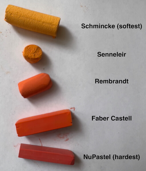
Different pastel brands have different hardness, and it’s best to layer from hardest to softest, so that the paper’s tooth isn’t saturated too quickly. Once that happens, additional pastel layers won’t stick.
Considering the pastel brands I have on hand, that means testing pastel layering in this order:
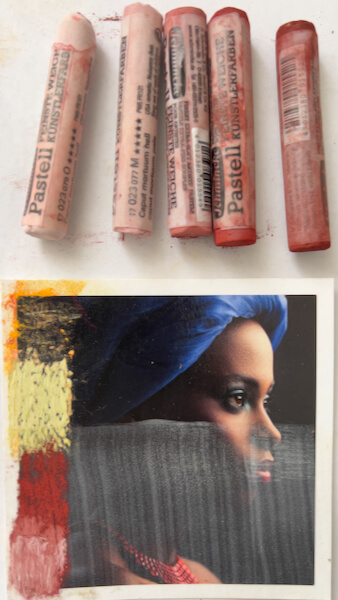
The pastel brands I own, from softest to hardest. Oops, I misspelled Sennelier, i before e.
Naturally, I won’t be using all those brands for every artwork. I mostly use NuPastel, Rembrandt and Schmincke, simply because I currently own more colors in each. Further, I may want to use a lot of Schmincke and none of the others, for the same reason.
#1: Five Layers of Pastels, Hard to Soft
For good measure, I started with one layer of each brand listed above. This is how it went, in my first experiment of actually painting on photos.
First, a single color of NuPastel applied:
One layer of NuPastel color, applied to each photo paper. The top two photos were scratched by the pastel stick.
NuPastel scratched the Hahnemühle Baryta Giclée print. It also didn’t stick to the paper much.
NuPastel scratched the Hahnemühle FineArt Pearl Giclée print. It stuck to the paper even less.
NuPastel on Hahnemühle Torchon, which is semi-textured.
On the Hahnemühle Photo Rag, which is smoother.
NuPastel on Hahnemühle William Turner, which is very textured.
Next, after all five brands (five different colors, hardest to softest) were applied, this is how the papers looked:
All five papers with five layers of pastel applied, from the hardest to softest brands of pastels.
Five layers of pastel on Hahnemüle Baryta. Once the extra was knocked off, only a little remained.
The same five layers of pastel on Hahnemühle FineArt Pearl. Once the extra was knocked off, almost none remained.
Five layers of pastel on Hahnemüle Torchon. A fair amount of paper texture shows through.
Again, five layers of pastel, this time on Hahnemühle Photo Rag. Very little texture shows through.
Five layers of pastel on Hahnemüle William Turner. The most texture shows through.
Then I tried blending the layered pastels using a bit of pipe insulation:
All five papers with the five layers of pastel, blended using a bit of pipe insulation. The pastel on the Baryta and FineArt Pearl (top) was mostly erased. A nice, translucent layer remains on the matte papers, allowing the photograph to show through.
Takeaways
Glossy and pearlescent surfaces—Hahnemühle Baryta and FineArt Pearl—won’t hold pastels (not even one layer), without some other medium applied to create tooth. Further, the harder pastels will scratch these surfaces if applied directly. When rubbed with pipe foam insulation, the pastel is nearly erased.
The matte papers—Torchon, Photo Rag and William Turner—are just fine with five layers, consisting of each of the brands.
Naturally, the textures of the matte papers affect the pastel appearance, with:
William Turner being the roughest
Photo Rag fairly rough
Torchon the smoothest
When applied pastel is rubbed on the matte papers, the five layers of pastel spreads well. That said, one would generally blend one layer, or the earliest layers, when applying pastels, and then leave pastel strokes showing on later layers.
A Note on the Dulling of Pastel Color through Blending
Dry stick pastels are essentially crystalline, hence their luminosity. I’ve read that blending (rubbing) breaks down their structure and dulls them. Honestly, I’m not sure if I buy that. After all, the pigment in its raw form is ground very fine, before it is mixed with binder and formed into pastel sticks. Perhaps I’m wrong, but it seems that any crystalline structure is already powdered in the process. Would rubbing, then, do any worse damage to its structure?
If a color seems duller after being blended, I think there are other causes. Perhaps one may be the result of pushing the pastel into the paper fibers, leaving less color on the surface to catch the light. Alternatively, dulling of the color could occur when it blends with other colors underneath—whether other pastels, or a base color in another medium—leaving it less “pure,” with reduced vibrancy. (Surely, this phenomenon has been formally studied by color manufacturers, as they test the application of their colors to various surfaces.)
#2: Five Layers, All Schmincke (the Softest Pastel)
For experiment number two, I applied five pastel layers using only the softest pastel brand, Schmincke.
The matte papers with five layers of the softest Schmincke pastel, with no fixative. You can see on the second photo, the Photo Rag, that the fifth color barely stuck. On the bottom, the William Turner, it stuck some. However, the paper was pretty saturated, and the last layer of pastel smeared.
Takeaways
Without any fixative, all five matte papers can accept 5 layers of Schminke soft pastels, but do better with less.
Unsurprisingly, with the Torchon—the smoothest—it started to feel like it was getting saturated at the third layer, seemed mostly saturated at the fourth layer, and barely took a fifth application.
Surprisingly, the William Turner—the roughest—also started to get saturated, but not until the fourth layer. The fifth layer behaved better than on the Torchon, yet started to smear.
Only the Photo Rag seemed to take five layers of the Schmincke well.
I might not want to use so many layers on much of the photo prints anyway! But it’s good to know the limits.
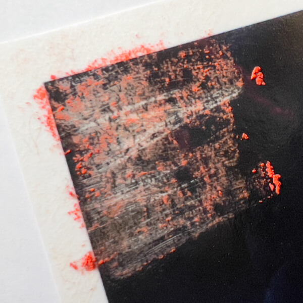
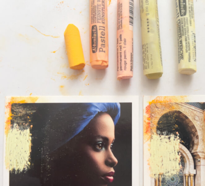
#3: Painting on Photos with Five Schmincke Pastel Layers, with Fixative
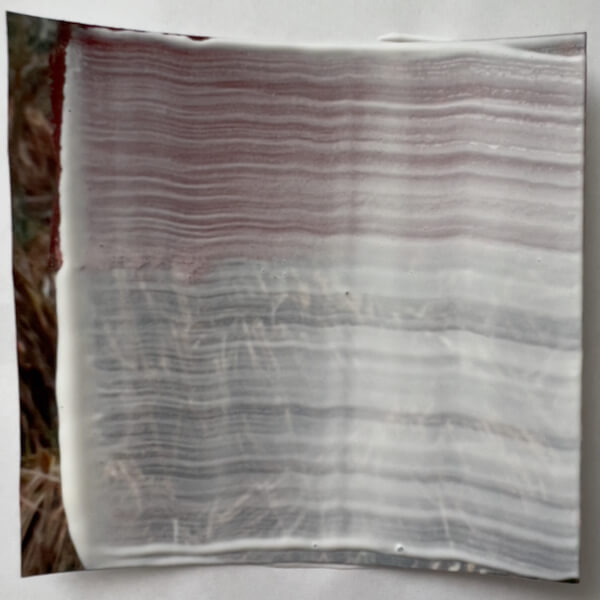
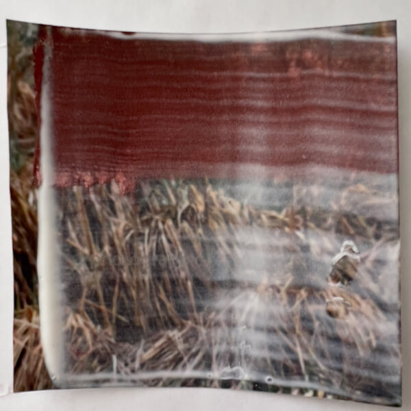
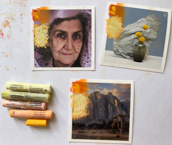
Knowing that the paper fibers could get easily saturated, I started by spraying the left side of each paper with Schmincke pastel fixative, and again spraying each pastel layer after it was applied.
The Baryta darkened slightly, after the fixative was applied. The Pearl also showed a very minor darkening.
The Baryta partly sprayed with fixative (from top to the red line), showing a little change in the darkness.
After five layers of the softest pastel brand were applied with fixative, here were the final results:
The matte papers with five layers of the softest Schmincke pastel, this time using fixative before and between each layer. All the pastel layers worked. Here you can see that the middle paper, the Photo Rag, is the smoothest, and the William Turner on the right is the roughest.The Baryta and FineArt Pearl papers with five layers of the softest Schmincke pastel, this time using fixative before and between each layer. All the pastel layers worked.
Takeaways
Starting with fixative was probably not necessary with the matte papers, but it was essential to the layering of pastel colors on glossy and pearlescent prints.
Spraying in between every layer made it possible to build five layers of the softest pastel, on every single Giclée print!
The fixative slightly darkened the glossy and pearlescent papers, especially where they were already dark.
No noticeable darkening happened on the matte papers.
Well, that’s it for today! I’ve already started the next round of experiments with painting on photos, but they will save for the next report.
An announcement: I have been included as a featured photographer by Glass, in an article of curated photographs! 🥳 It was a mild and friendly form of competition, and I am thankful for the honor.
What is Glass?
Glass is an app and web site, where photographers gather to share their work, interact to offer praise and helpful feedback, and—soon—connect in person through worldwide, in-person meetups. It’s one of two social media platforms I use (the other being Mastodon), and I appreciate that it’s non-commercial. Glass also has no algorithm, other than the one you create and control by choosing which photographers you wish to follow. There is a free trial period, then a monthly subscription, which keeps it private and commercial-free. If you’re curious what I’m posting there, see my Glass account.
Featured Prompts
Every month, the makers of Glass announce a new category prompt, selected from user suggestions. Photographers get busy sharing relevant images. At month’s end, Glass publishes an article of the curated highlights by featured photographers.
June 2023’s category was “Rural,” and there were many interesting submissions selected for the curator’s favorites. If you’re eager, you can jump to the rural photos below.
Miss Flower Child, or: How I Learned to Stop City Living and Love the Country
Frankly, Rural is one of those categories that’s right up my alley. Despite spending most of my first 20 years in urban areas—Frankfurt, Bangkok, Washington D.C., we also lived for three years in the Virginia countryside, close to the Shenandoah River. I was a young person then, three to five years old, and formed my earliest memories among shady woods, rolling hills, deer, bears, lightening bugs, chipmunks, salamanders, spiders, and foxes.
As an aside, do you know that horrible song, “What Does the Fox Say?,” by the Norwegian band, Ylvis? I know what the fox says. Likewise, so does anyone who has lived around foxes during mating season. Evidently, Ylvis didn’t do their research!
Anyway, our family spent a lot of time in national parks, picnicking, camping and hiking. Similarly, I did all the usual Girl Scout activities. At about nine, I discovered the early albums of John Denver, a champion of rural. I was in love.
Perhaps I should explain the heading above. I was born in Germany, to German parents, who were among the very first hippies in Frankfurt. Fittingly, it was the Summer of Love. They’d married, but weren’t ready to be parents, or to stay together. I was eventually adopted away by a wonderful American couple, who’d been living in Germany for some years. Decades later, after my (adopted) dad died, mom told me that they would privately refer to me as their “little flower child.” (Comparatively speaking, it’s turned out that I’m a burner, rather than a hippie, but both are non-conformist.)
Cosmopolitan, with Rural Roots
People are often surprised to learn that my adopted dad was the son of sharecroppers, grew up picking cotton in Arkansas, and went on to travel to over 200 countries during his career as a diplomat. (It’s a story!) Conversely, mom grew up in Washington, DC, the daughter of a stylish divorcée, but her roots were Pennsylvania Dutch.
Naturally, we got even more rural goodness visiting relatives. I remember riding in the car on long road trips, with my nose practically pressed against the window, looking at all the scenery passing by. Soon enough, my brother and I were trampling farm fields, wading in streams, exploring woods, and poking around abandoned houses and barns. Further, there were feral cats, butterflies, horses, praying mantis eggs, owls, earthworms, newts under river rocks, and birds nests with eggs.
Ah, the joys of childhood. Be that as it may, it befuddled me that Arkansans might think me weird for wanting to draw designs on my face, with makeup pencils. Didn’t they understand artists? NO? Well, I was there to teach them … at the ripe old age of eleven.
Unsurprisingly, with all that exposure to nature, I came to deeply appreciate its sublime beauty. The wilder, the better. For that reason, my personal mantra became, “I want the world to be wild, and I want to be wild in it!” (If only that could have come true…)
Rural in Europe
Following my childhood, I have spent 22 years living in rural locations as an adult: on mountains, near rivers, and among farmlands. In fact, the last place I lived in the US was West Virginia. Almost heaven indeed, save mountaintop removal and illiberal politics.
Now that I reside in Germany, I am surrounded by about 420 kilometers of vineyards; roughly 70 km north-south and 6 km east-west. With mountains in view, I’m again in heaven. Yes, the US has more remote wilderness than Europe. Nevertheless, with houses gathered in villages, towns and cities, there is still plenty of European countryside: great forests, amazing parks, and drop-dead gorgeous vistas.
I’m lucky that my German husband loves to show me some of the beauty Europe has to offer. I take my camera virtually everywhere we go.
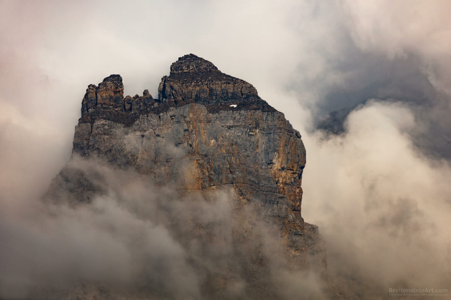
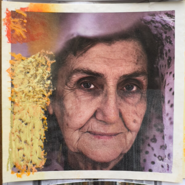
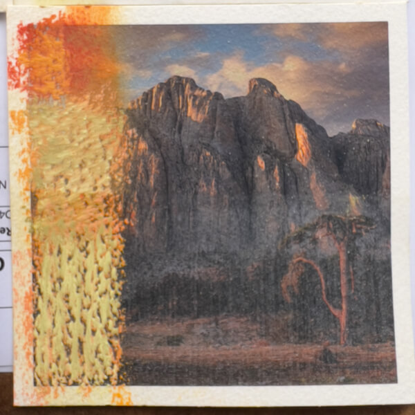
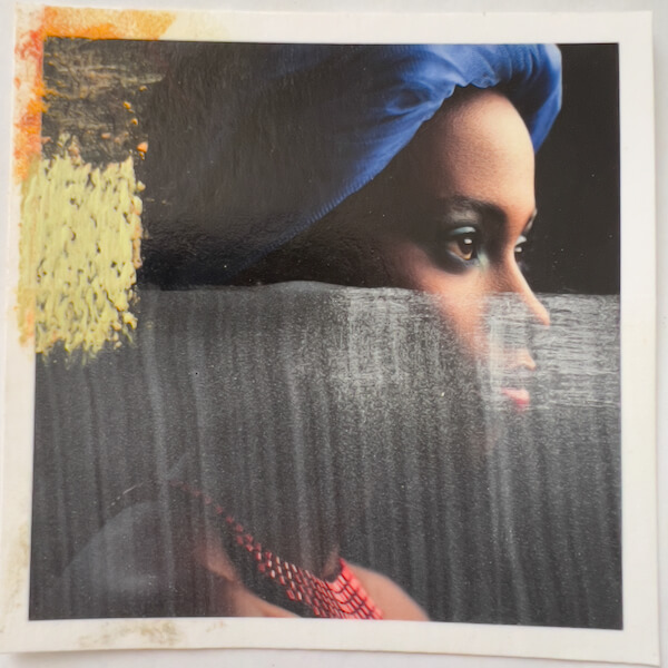
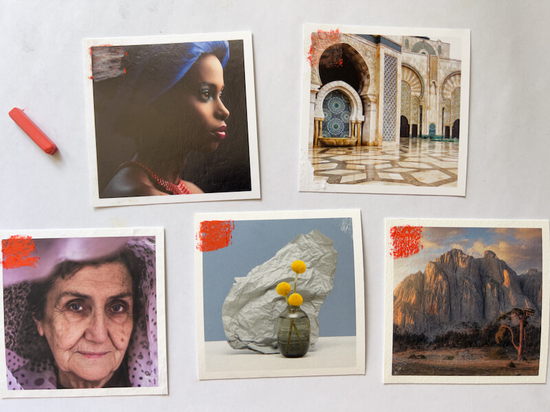
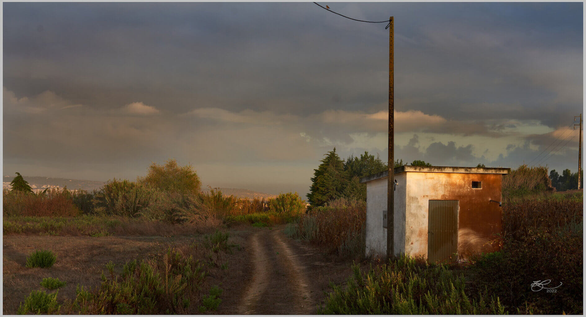
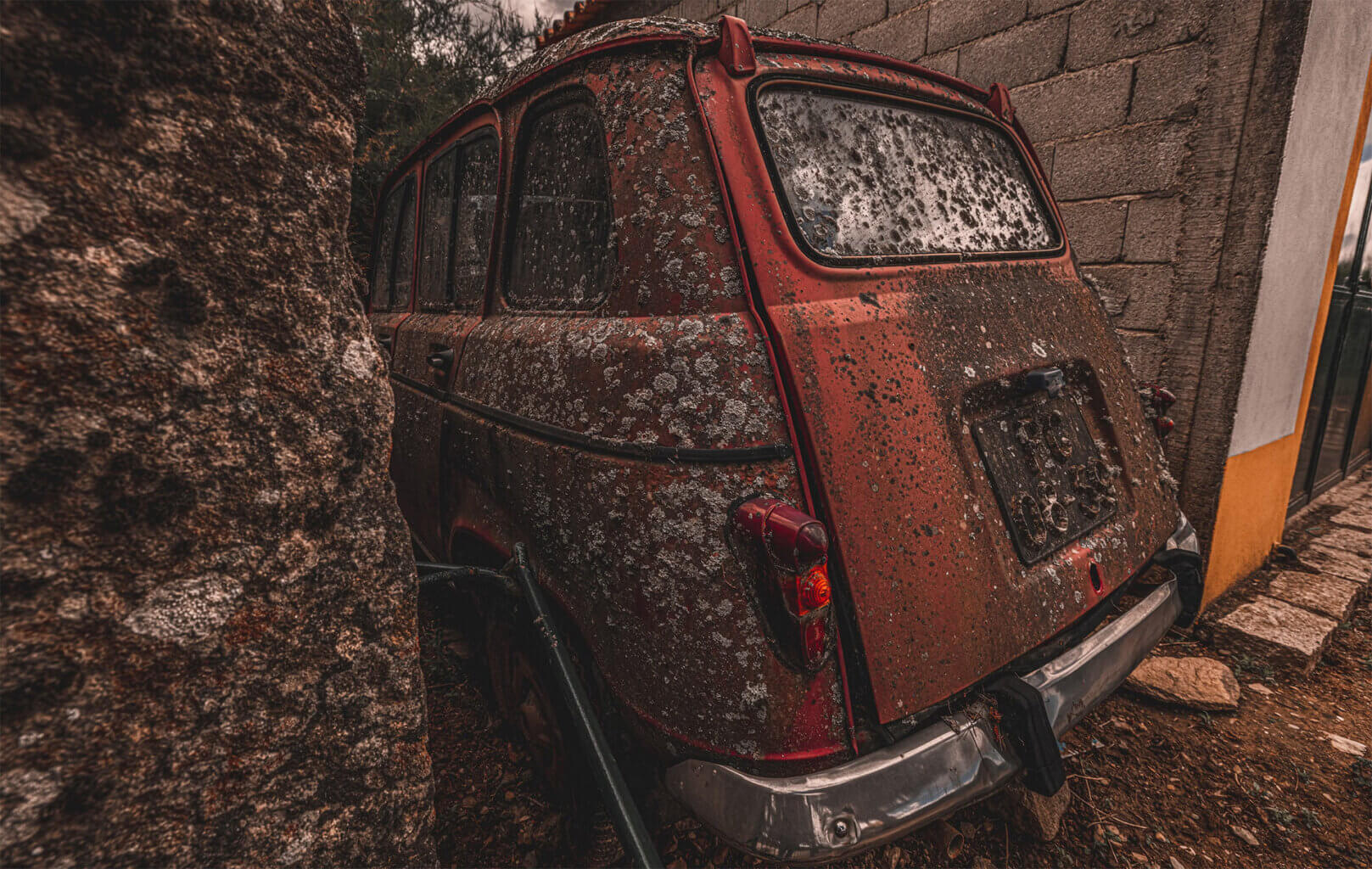
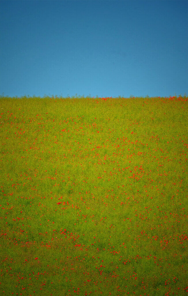
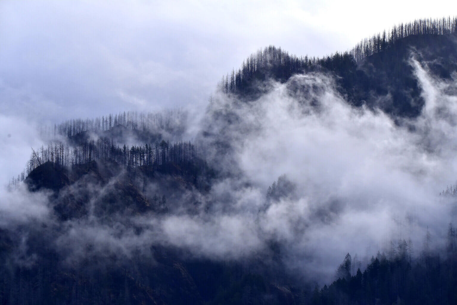
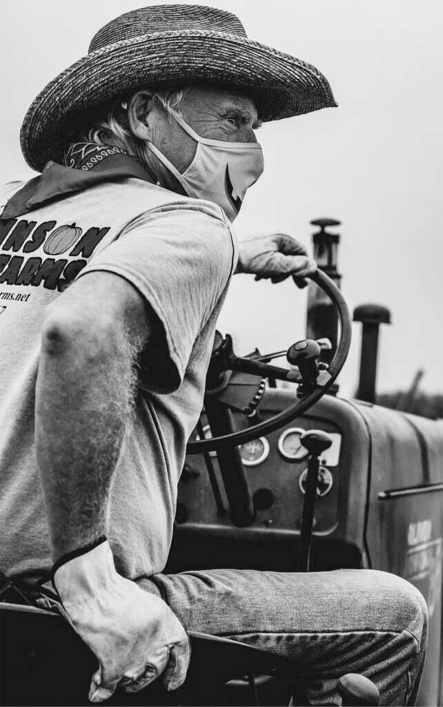
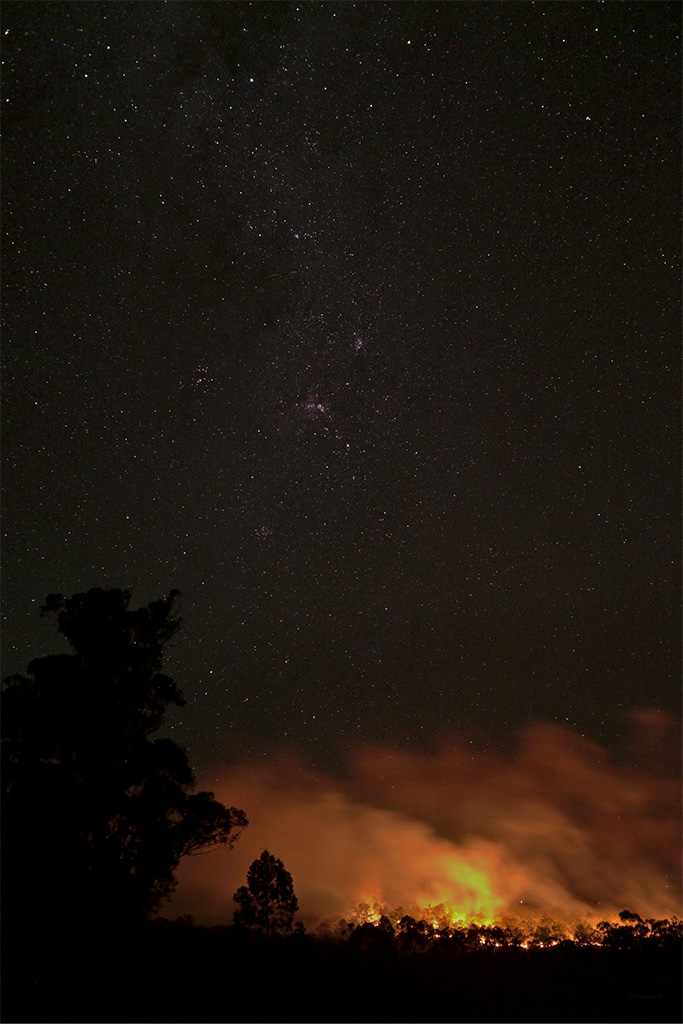
My Featured Photograph
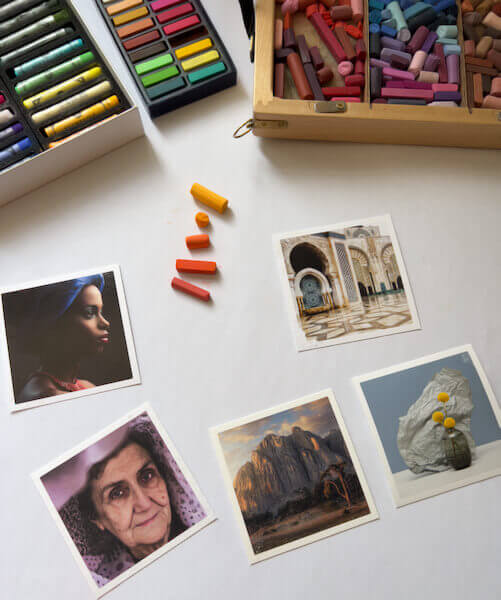
For example, on a recent trip to Italy and Switzerland, I shot the photo that was included in the Glass article. This is it:
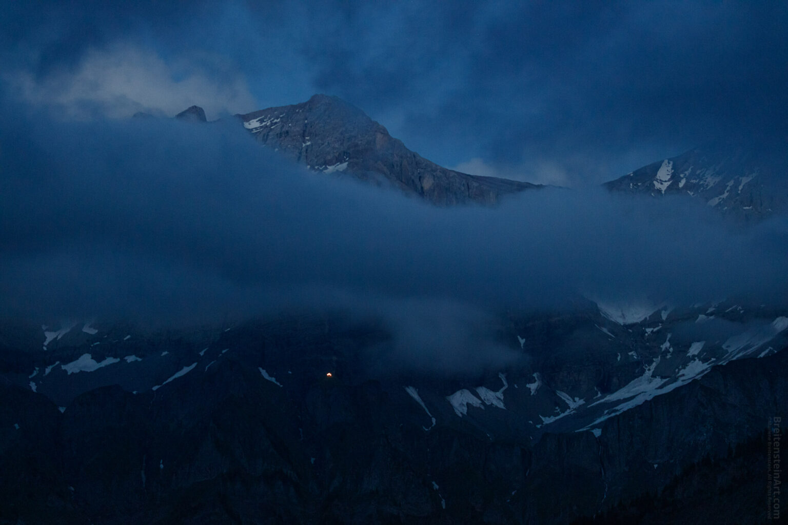
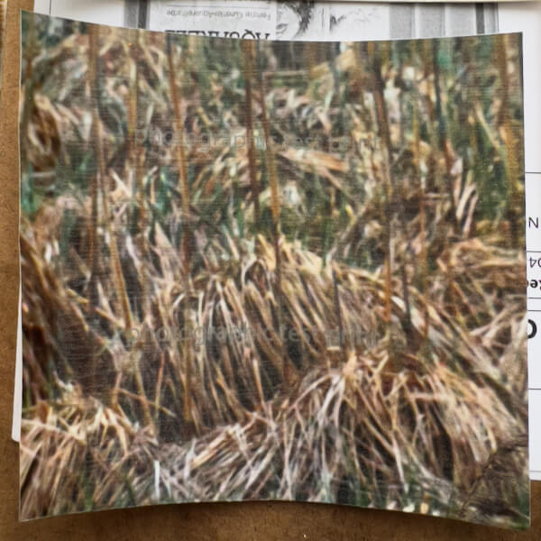
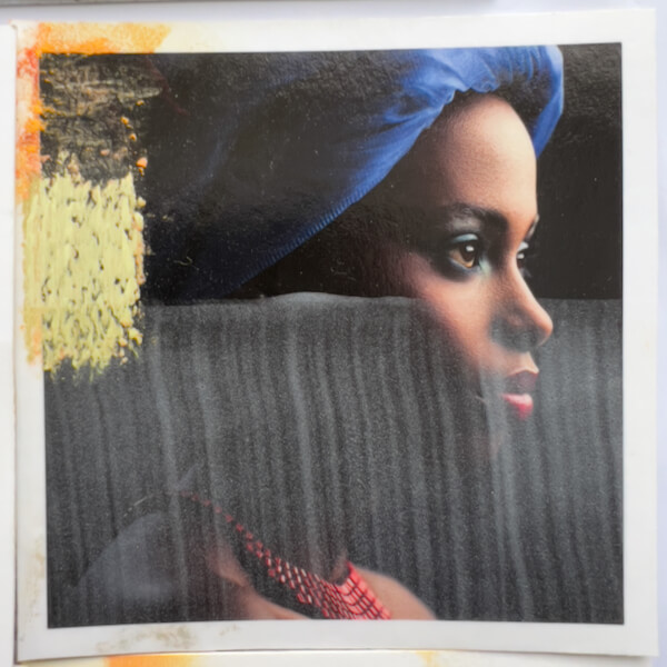
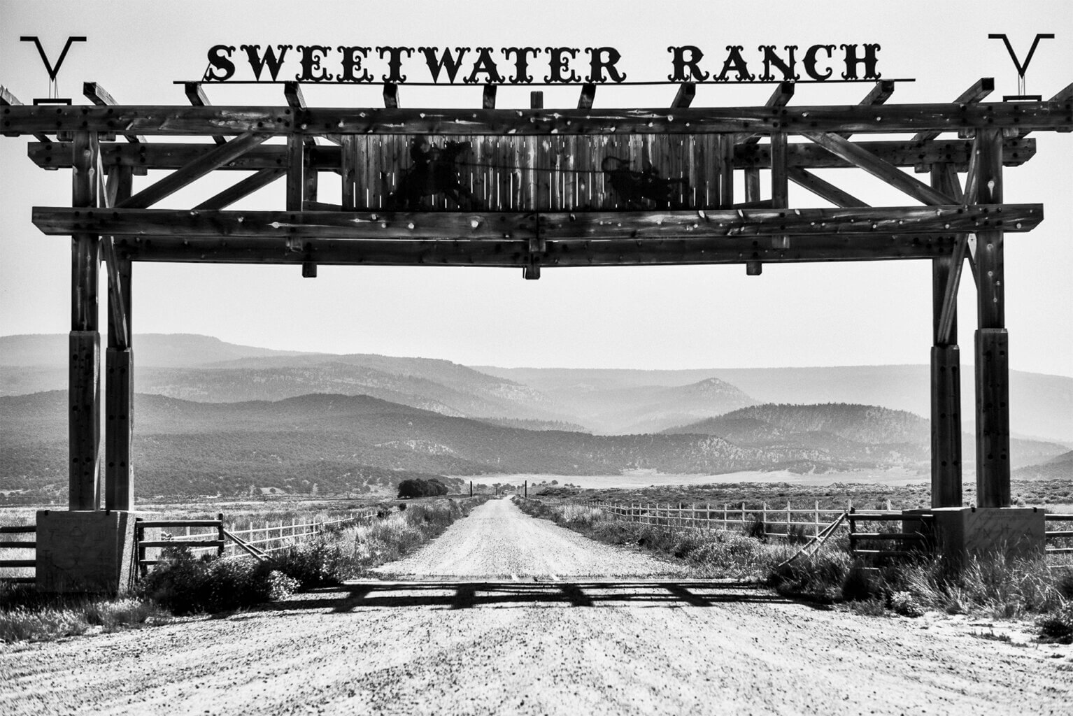
More Rural Photographs, by Other Glass Photographers
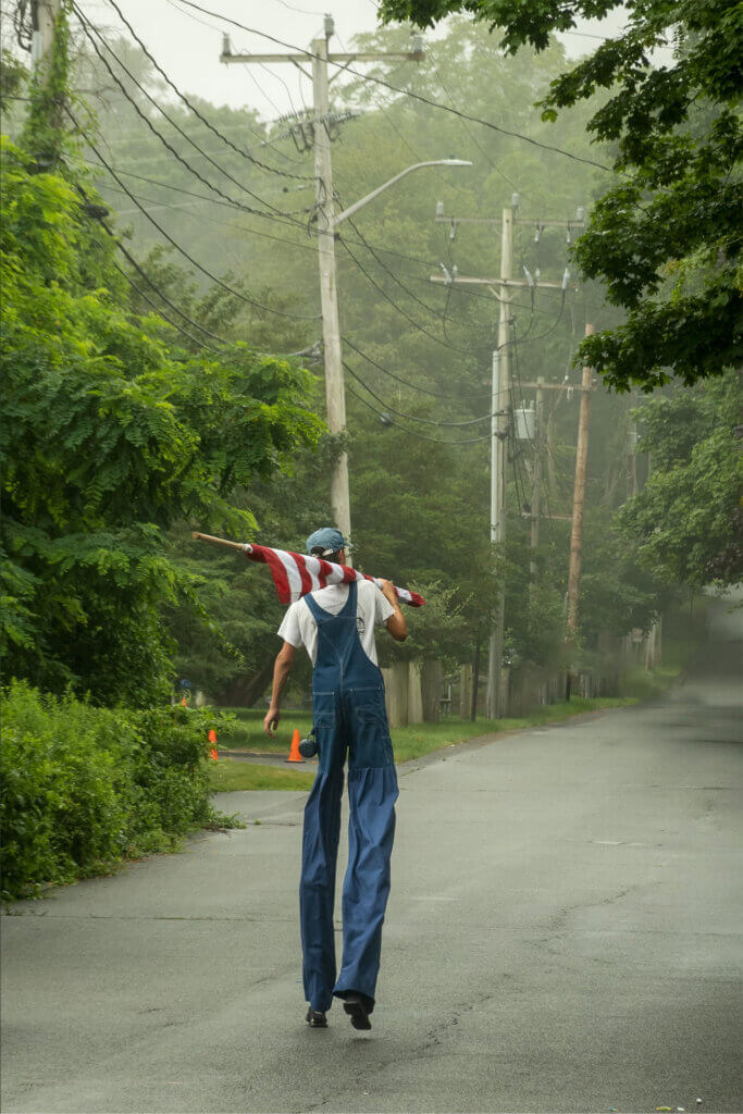
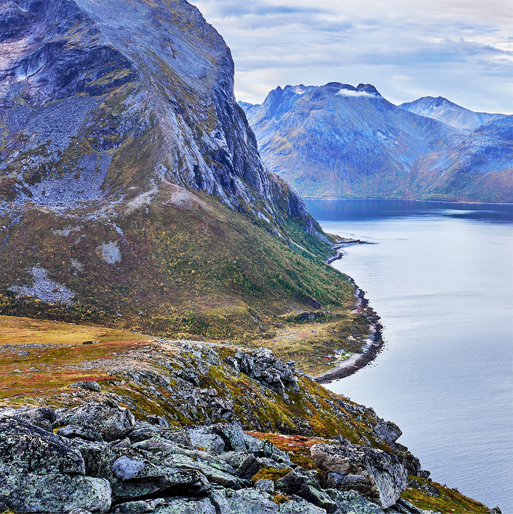
I like sharing the limelight, so here are other photos from the Rural prompt, this time by fellow photographers. There is only a little bit of overlap with the Glass featured photographers, and I felt these deserve more eyes, too.
Please see the captions for the photographer’s name, and a link to more of their work. I have included these by permission.
In my newsletter last month, I mentioned plans to experiment with painting on photos. How has it gone so far? The short answer is: slowly, but I’ve learned a lot already!
Getting Photo Prints
The first hurdle was deciding where to get my photographs printed. I got help from a professional photographer, who has become a casual mentor. [Note: If you’re considering looking for a mentor or mentee, check out this excellent podcast “The Photo Mentor and Mentorship.”] When I mentioned wanting to find a high-quality photo printing company, he recommended White Wall. A superlative suggestion, White Wall has won numerous TIPA awards, are considered a global leader, and conveniently for me, have operations in Germany.
White Wall offers photo printing on a myriad of paper and canvas surfaces. They also print photos on aluminum and wood substrates, among other things.
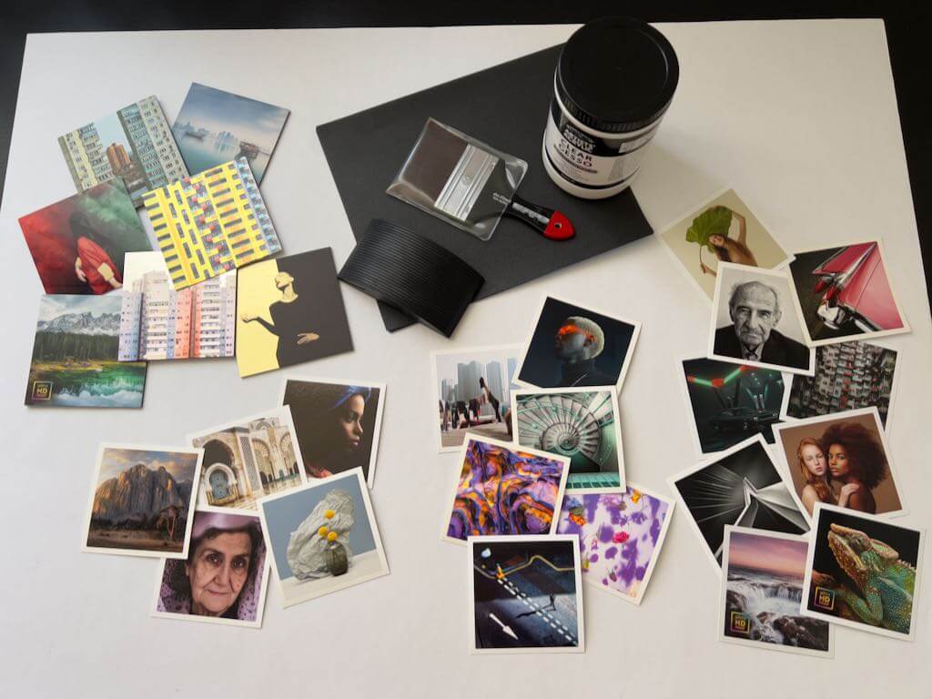
For my paintings, I am interested in working on larger, fine art giclée photo prints, mounted on a hard and durable surface, that I can frame directly. I ordered samples from White Wall to play with: the “Prints and Photo Sample Set,” and the “Aluminum Sample Set.” Further, since I’m also going to sell straight-up photo prints, I ordered a large, glossy test print, using their “UltraHD Photo Print” method.
The order has arrived. I am deeply impressed. The samples are so gorgeous, I don’t even want to spoil them by experimenting on them! But I will…
These images are too compressed to do the big, UltraHD test photo print justice—it is AMAZINGLY SHARP.
Choosing Surfaces Suitable for Painting on Photos
While I was waiting for those to arrive, I sent emails to White Wall and Hahnemühle, inquiring about surfaces.
White Wall
I asked for confirmation on White Wall’s most durable paper/aluminum surface combinations, for painting on photos. After describing my intentions, I wrote:
Might any of these surfaces be more suitable? I have selected these because they appear to be coated with a UV protective laminate, or are water-resistant (aluminum) and hangable in bathrooms and rain-sheltered areas.
Fine Art Print On Aluminum Dibond
Direct Print On Aluminum Dibond
ChromaLuxe HD Metal Print (I would rough up the glossy surface, or coat it with a medium, to create a surface that will take pastels)
Photo Print On Aluminum Backing (Fuji Crystal DP Matte)
Photo Print On Wood
They promptly replied:
As far as I understand the process correctly, the materials you have chosen are already a very good choice. Especially the Fine Art on Alu Dibond offers you a clean surface to apply colour etc. to the picture afterwards. We use Hahnemühle and Canson papers for the Fine Art print on Alu Dibond. With direct printing on Alu Dibond, you also have a rough surface that can be easily processed with colours. HD Metal is a very smooth surface, as you correctly say. To be honest, we have hardly any experience with post-processing by artists here, which is why an experiment on your part would be appropriate. Feel free to share your results with us, we are curious about the reactions of our products. Here’s a discount code. [Yay!]
Since I’ve used their papers in the past, I decided to focus on…
Hahnemühle
I wrote to Hahnemühle, describing how I historically work with pastels. Then, I inquired which of the Hahnemühle papers, used by White Wall, might work best for wet and dry media over printed photographs. They also promptly replied:
Everything that White Wall has recommended are Digital Fine Art ink jet papers. All are suitable for your prints, but I would recommend choosing Fine Art Baryta for really dark/black prints, because of the whiteness. Regarding the matte papers, it is more likely a sense of your own taste. The William Turner has a unique structure, the Torchon has much less structure, and the Photo Rag® is a smooth paper. Nevertheless, we do not have any experience with painting on prints, so we are not able to give any recommendations here. Also take a look at our brand new Hahnemühle App with a large knowledge database about fine art printing with Hahnemühle paper.
Methods for Painting on Photos
Curious about how to approach my experiments, I investigated methods for painting on photos using soft pastels, my preferred medium. (I may eventually also try oil pastels, wax encaustic, acrylic paints, oil paints, and/or inks and stains.)
Like everything, soft (chalk) pastel has its pluses and minuses. Pastels consist of pigment, combined with the minimal amount of binder needed to hold the pigment together. Since there is no “carrier” medium (oil, acrylic, wax, etc.), pastels provide rich, bright colors, which is one reason why I prefer them. Painting with pastels avoids problems like cracked surfaces (oils, especially if you don’t paint fat over lean), yellowing (oils, waxes), or the uncertainty of colors drying darker (acrylics). The downside is that with most pastel techniques, the final work needs to be framed under glass to avoid smudging, usually even when it is sprayed with fixative.
Unfortunately, I found a lot of information about using everything except pastels to paint on photographs. But two helpful articles finally surfaced. [NOTE: I often save offline copies of the most useful reference articles I find on the web. This is because over time they tend to disappear. You might consider doing the same.]
Pastels and Gesso
First, I came across this interesting post, a Soft Pastel and Clear Gesso Technique, by Cory Goulet. An abstract pastel and mixed media artist, Goulet describes using clear gesso with a heat gun, to create a textured and toothy surface that accepts layers of pastels nicely. You can layer more gesso, pastel and fixative, and end up with a pigment-holding surface that may not need glass. I have to try it.
A Chapter on Hand-coloring Digital Prints
Second, I found an entire chapter on Handcoloring using water, oil or chalk as a base, from the book New Dimensions in Photo Processes. The section on “Chalk-based methods for hand-coloring digital prints” includes information on safety, materials and methods. Safety is a consideration with any media, and pastels are no exception. Pastel dust has what can be described as little barbs (like a fishhook), and once it lodges in your lungs, it’s probably not coming out.
Stev’nn Hall
I should also mention discovering the art of Stev’nn Hall, whose web site unfortunately doesn’t seem to be working. However, I did find this article, which said:
“To create these works, Hall begins by taking photographs, combining upwards of 40 digital images per piece into a single, comprehensive panoramic view, anchored by a definitive horizon line. Once the image is created in the computer, he prints it and mounts it on birch panel. That’s when the piece really begins to come alive: Hall embellishes the image, painting, scratching, and applying stains, oil paint, pastel, and ink.”
That’s all I’ve learned about his methods for painting on photos. Nonetheless, it’s food for thought.
Selecting a Clear Gesso
Next was determining the best gesso; neither too thick, glossy, or cloudy. Cory Goulet prefers Liquitex, but I wasn’t happy with its apparent milky tone, judging by her in-process photos (I could be wrong). Since I am going to be using the gesso over photographs that I still want partly visible, I need a medium that will be as clear as possible. After reading about several of the better known brands, and their “clear” or “transparent” gessoes, I narrowed my options down to three:
Winsor & Newton Artists’ Acrylic Clear Gesso
Art Spectrum Supertooth Colourfix Pastel Primer
Liquitex Clear Gesso
In the end, I settled on Winsor and Newton’s Artists’ Acrylic Clear Gesso, which they describe as, “completely clear when dry.” Jerry’s Artarama had this to say about it:
Offers excellent tooth for great paint adhesion, fast drying, with a balanced absorbency. The Clear Gesso is exactly that: clear, not milky like some other “clear” gessoes. It can be tinted with acrylics to add some color to your primer or used alone to allow the qualities of your canvas or board to show through. Non-yellowing, flexible, and with all the tooth, absorbency, and fast-drying properties you need. The unpigmented Artists’ Acrylic resin base dries absolutely transparent. Perfect for acrylics, oils, and alkyds, it also makes an excellent ground for charcoals or pastels.
Sold.
Other Supplies for Painting on Photos
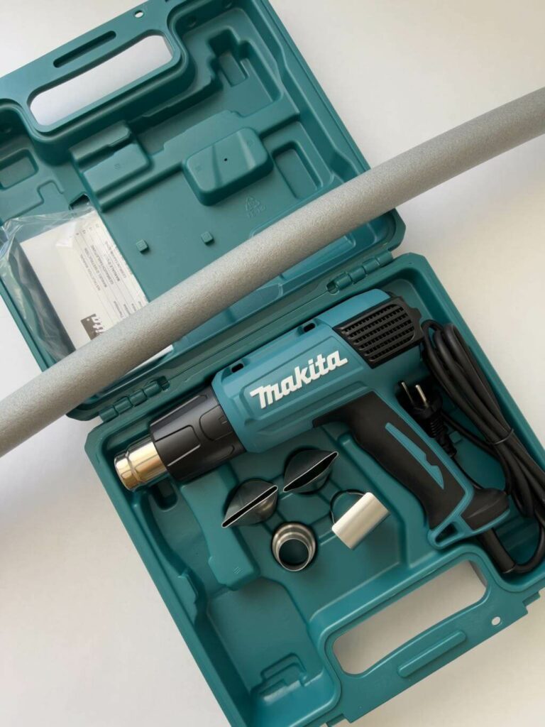
Then came investigating and deciding on a good, large brush for smooth gesso application (hopefully with no lost hairs left behind), procuring the right sandpaper grits to scuff surfaces, and selecting an appropriate heat gun with variable temperatures. Here’s what I ended up getting:
Sandpaper in grits 120, 180 and 240, for sanding surfaces to various smoothnesses
A Makita HG6031VK Variable Temperature Heat Gun
A da Vinci Top Acrylic, Series 5040, wide synthetic brush, 80 mm (a little over 3″)
Unfortunately, I had to order everything, since our local, tiny craft store doesn’t carry serious art supplies.
How it All Looks
At this point, everything has finally arrived. I’m both excited, and intimidated, to start my experiments.
Each of the white-bordered prints shown below is on a different, gorgeous paper. The aluminum sample group is in the upper left, and includes three metallic surfaces that show through the prints, we well as four other surfaces.
The heat gun and pipe insulation.
My First Experiment Towards Painting on Photos
I have decided to test with the Hahnemühle fine art giclée prints first, then move on to the AluDibond.
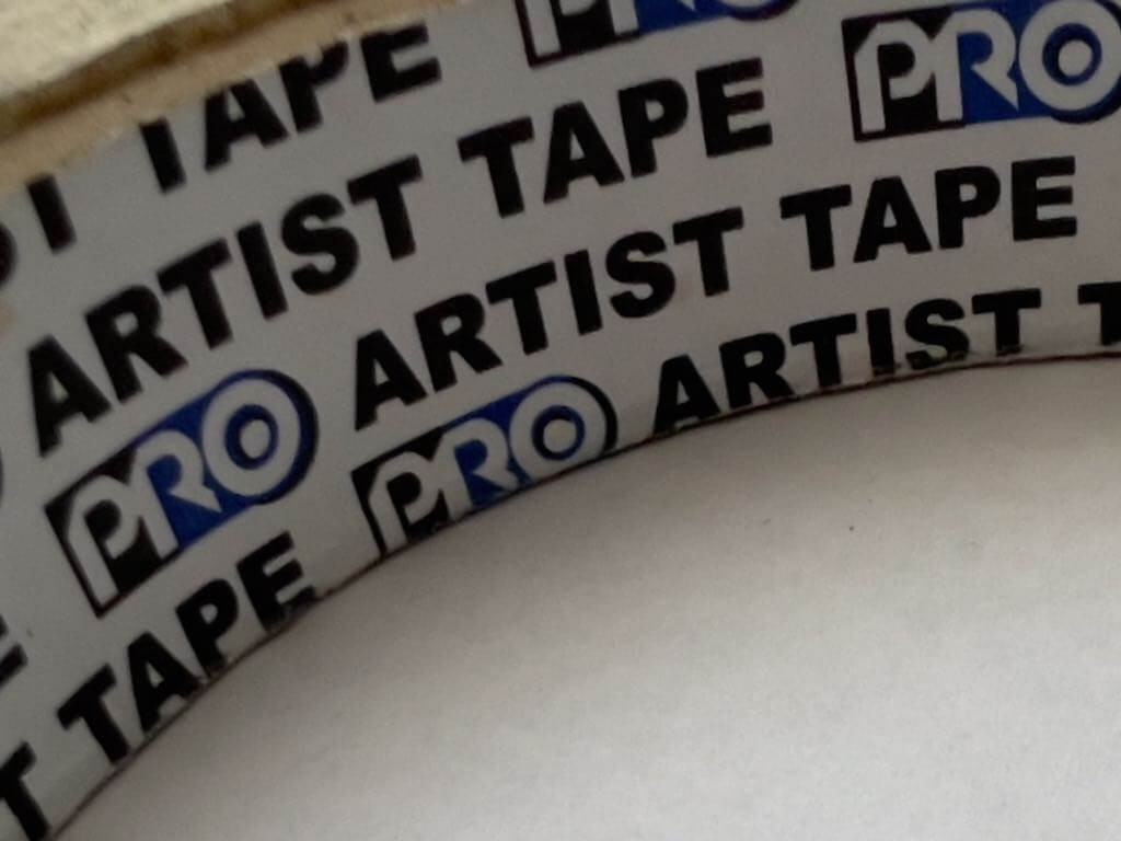
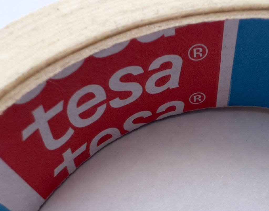
My first experiment was taking two types of tape—”Pro” brand Artist Tape, and a Tesa tape that’s either masking or painter’s—and seeing how they behave on the prints and paper.
The Results Weren’t Great
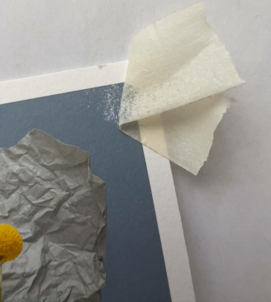
I pressed the tapes on firmly in each test. The “Pro Artist Tape” left a very gummy adhesive residue on the Hahnemühle Baryta. It was impossible to remove. However, it didn’t pull up pigment or paper after firmly sticking for a short time, though I had to peel it off very carefully. Similarly, the Tesa tape left residue too, but less, and still unremovable. Neither pulled up pigment or the paper’s surface, which I am guessing is due to the printed surface.
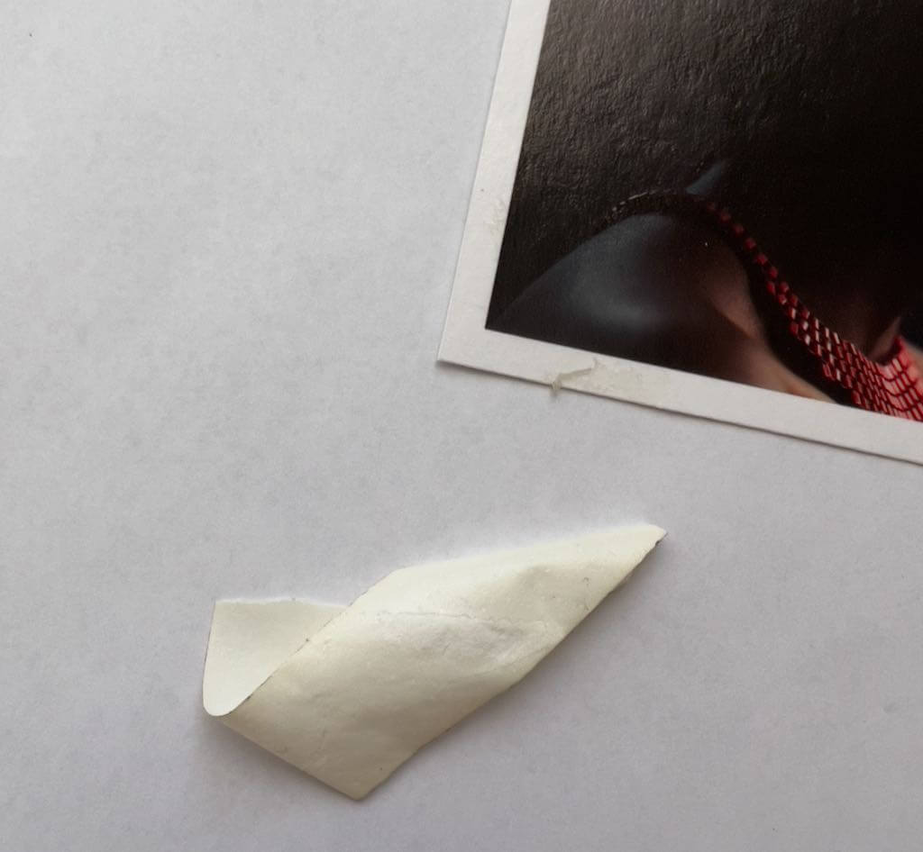
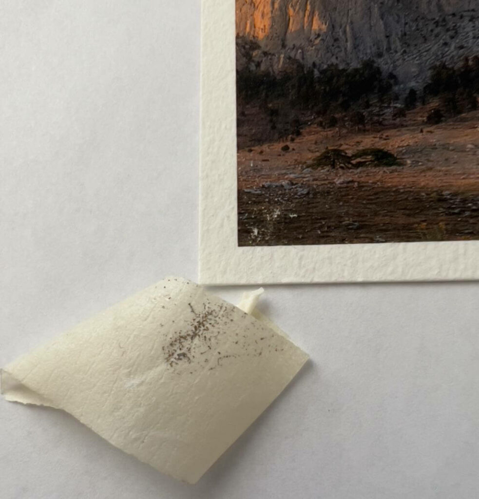
I tried the Pro on the Hahnemühle Pearl, and it pulled up the paper so badly, it ripped into the image.
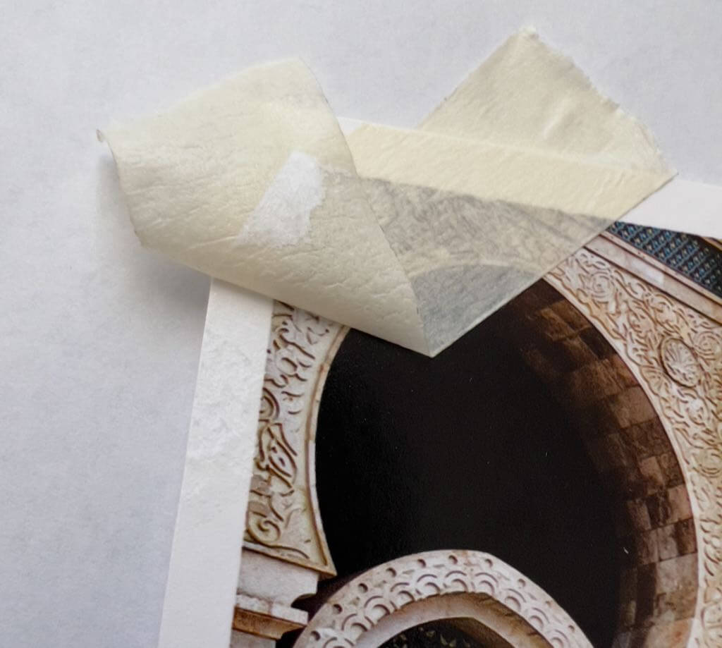
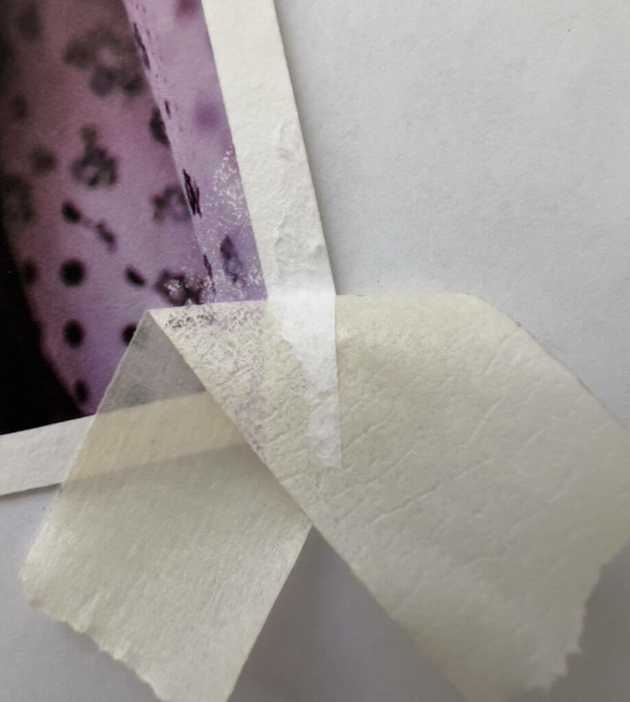
After giving up on the Pro tape, the Tesa tape pulled up pigment on all the matte Hahnemühle papers: the Torchon, Photo Rag, and William Turner. (Paper fibers too, in varying degrees.)
Therefore, if I want to mask portions of photos when applying gesso, I will need to find a different tape. Maybe mine were old or cheap, I’ve had them a while. It’s also possible that all tapes will pull pigment off matte fine art photographic prints.
Significant “Pro” tape residue on the Hahnemühle Baryta, hard to see here. Otherwise, no damage. Less residue with the Tesa tape, and no other damage.
Tesa pulls up the paper on the Hahnemühle Pearl, but the pigment was unaffected. The “Pro” tape badly ripped into the image. (Not shown.)
Tesa pulls up the paper and pigment on Hahnemühle Torchon.
Here, Tesa also pulls up the paper and pigment on the Hahnemühle PhotoRag, but the paper damage is minor.
Tesa pulls up pigment on the Hahnemühle William Turner, with very minimal paper damage. (This is a watercolor paper, made to be taped.)
Bottom Line Regarding Tape
The three matte papers—Torchon, Photo Rag, and William Turner—probably shouldn’t be used with tape. This is not a condemnation of them, though, it’s just tape!
Only the gently glossy Hahnemühle Baryta didn’t lose paper or pigment with either tape, but both tapes left adhesive residue on the unprinted paper border.
The second most durable print surface, tape-wise, appears to be the Hahnemühle Pearl. With its pearlescent coating, it didn’t lose pigment with the Tesa, but did retain adhesive on the border, and some of the border paper pulled up.
Ta da! 😆 I know it’s not a lot of actual experimenting, but all the product research and procurement took time. (We were also away on vacation for 12 days.)
There’s still much to do. This week I will try more tests, and report back on my blog soon.
To provide the best experiences, we use technologies like cookies to store and/or access device information. Consenting to these technologies will allow us to process data such as browsing behavior or unique IDs on this site. Not consenting or withdrawing consent, may adversely affect certain features and functions.
Functional
Always active
The technical storage or access is strictly necessary for the legitimate purpose of enabling the use of a specific service explicitly requested by the subscriber or user, or for the sole purpose of carrying out the transmission of a communication over an electronic communications network.
Preferences
The technical storage or access is necessary for the legitimate purpose of storing preferences that are not requested by the subscriber or user.
Statistics
The technical storage or access that is used exclusively for statistical purposes.The technical storage or access that is used exclusively for anonymous statistical purposes. Without a subpoena, voluntary compliance on the part of your Internet Service Provider, or additional records from a third party, information stored or retrieved for this purpose alone cannot usually be used to identify you.
Marketing
The technical storage or access is required to create user profiles to send advertising, or to track the user on a website or across several websites for similar marketing purposes.