

Background
If you’re new to my blog, at this stage in my artistic development, I’m experimenting with painting on photos. Being both a photographer and painter, I want to combine these strengths! My preferred painting medium is soft (dry) pastels, which I plan to use over professional Giclée prints of my own photographs.
Unfortunately, pastel can be smudged unless placed under glass. I’d like to avoid that, since even expensive museum glass feels like a barrier to visual entry. Therefore, I will likely resort to using a wet medium in the process, to hold and bind the pastel, and perhaps as a final coat. We’ll see how that goes.
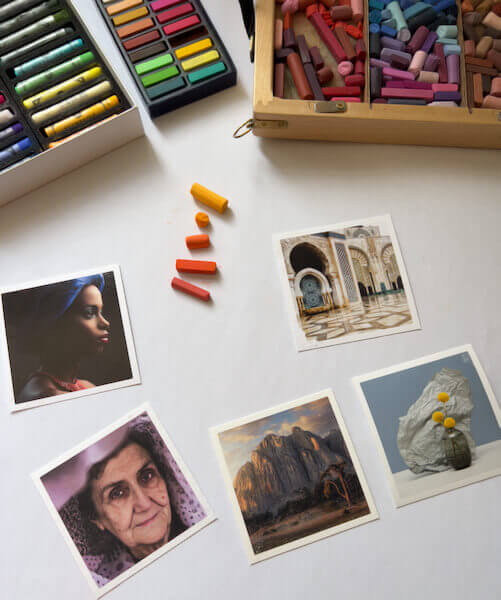
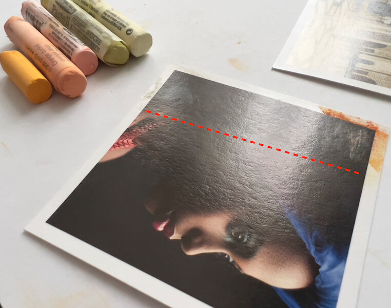
I’m experimenting on gorgeous photo samples that I ordered from the award-winning printer White Wall. They presently use five Hahnemühle papers: Baryta, FineArt Pearl, Torchon, Photo Rag and William Turner. Later I’ll move on to testing the aluminum surfaces I ordered, also from White Wall.
Recap of Part One
Earlier this week, I posted Part 1 of this process. There I discussed choosing White Wall, investigating paper surfaces, reviewing methods for painting on photos, and gathering supplies. Then I experimented with tape for masking, to see what would happen when I pulled each brand off the fine art prints. The results, with the tapes I tried, weren’t good.
That experiment done, next I needed to devise…
An Experiment Plan, for Painting on Photos
Yesterday, I nearly dove into applying pastel to one of the papers. However, I realized I’d better be strategic, or I’ll use up my small samples too quickly. Making the most of this opportunity calls for a thoughtful approach, to get comprehensive results.
My Plan
Based on the painting methods I’d reviewed (see Part 1), I decided to break my ideas for painting on photos into stages. I added steps as I went along, and this is my plan, so far:
- Direct dry pastel application in five layers, from hardest to softest pastels.
- Another direct application in five layers, using only the softest pastels.
- Applying the softest pastel layers with fixative, for a little tooth.
- Applying Winsor & Newton Artists’ Acrylic Clear Gesso smoothly, to gauge effect alone.
- Testing the gesso with layers of pastels.
- Applying the gesso with the heat gun, to create texture.
- Testing the textured gesso with pastels.
- Layering gesso and pastels, with fixative.
- What happens if I finish the painting with a layer of gesso?
Considering the small 4.3 x 4.3 in. (11 x 11 cm) sample prints from White Wall, that’s a lot of testing!
For this blog post, I completed steps 1-3 above.
Direct Dry Pastel Application in Layers
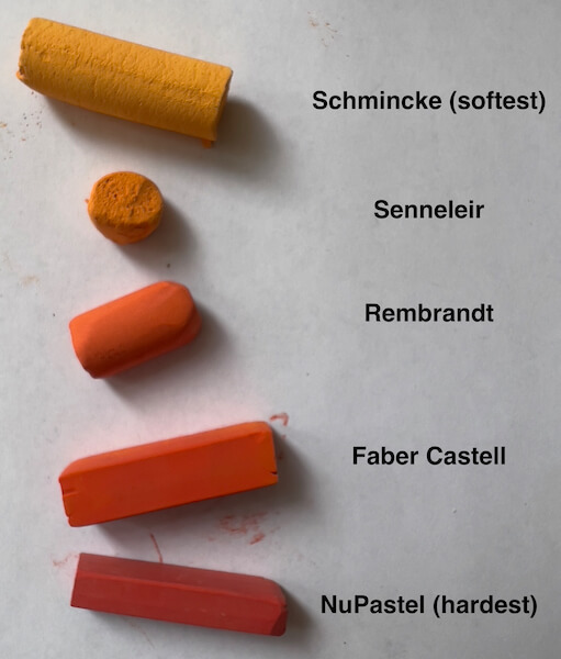
Different pastel brands have different hardness, and it’s best to layer from hardest to softest, so that the paper’s tooth isn’t saturated too quickly. Once that happens, additional pastel layers won’t stick.
Considering the pastel brands I have on hand, that means testing pastel layering in this order:
- NuPastel Color Sticks (the hardest pastels)
- Faber-Castell Soft Pastels
- Rembrandt Soft Pastels
- Sennelier Soft Pastels
- Schmincke Soft Pastels (the softest pastels)
[Note: If you have different brands, this is an old comprehensive list of pastel hardness. Newer brands won’t be listed.]
Oops, I misspelled Sennelier, i before e.
Naturally, I won’t be using all those brands for every artwork. I mostly use NuPastel, Rembrandt and Schmincke, simply because I currently own more colors in each. Further, I may want to use a lot of Schmincke and none of the others, for the same reason.
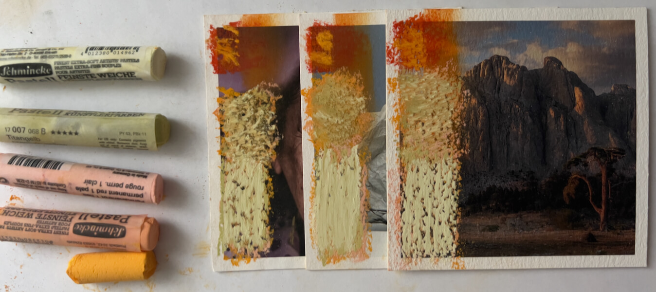
#1: Five Layers of Pastels, Hard to Soft
For good measure, I started with one layer of each brand listed above. This is how it went, in my first experiment of actually painting on photos.
First, a single color of NuPastel applied:
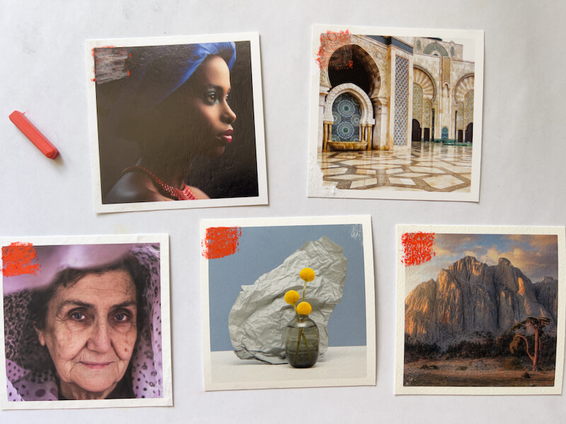
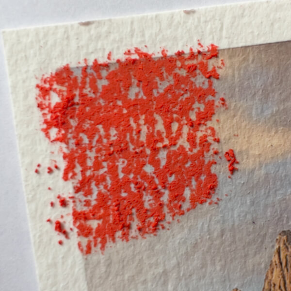
Next, after all five brands (five different colors, hardest to softest) were applied, this is how the papers looked:
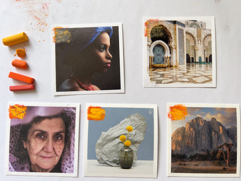
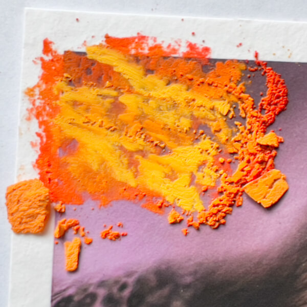
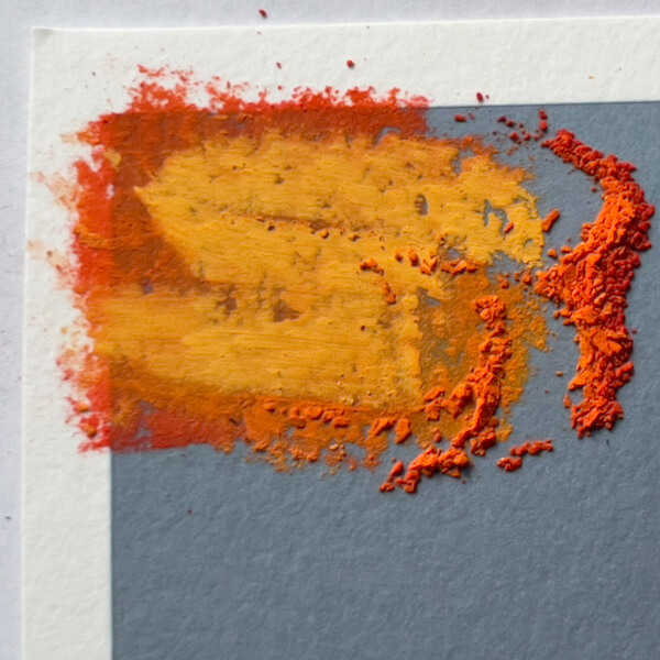
Then I tried blending the layered pastels using a bit of pipe insulation:
Takeaways
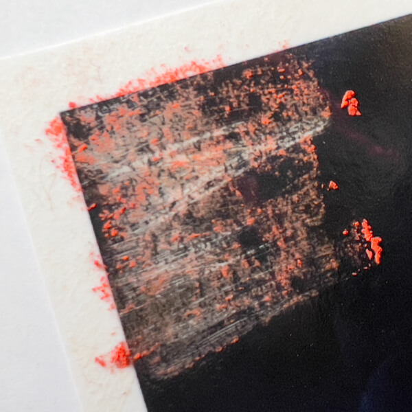
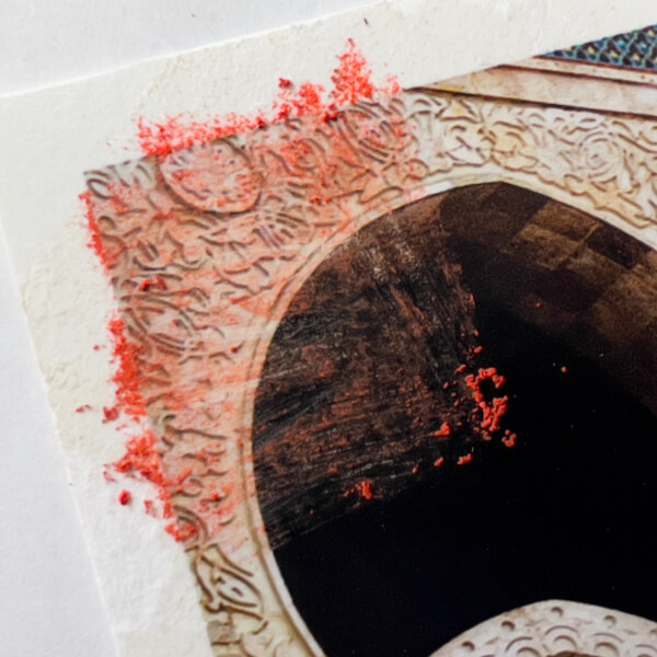
- Glossy and pearlescent surfaces—Hahnemühle Baryta and FineArt Pearl—won’t hold pastels (not even one layer), without some other medium applied to create tooth. Further, the harder pastels will scratch these surfaces if applied directly. When rubbed with pipe foam insulation, the pastel is nearly erased.
- The matte papers—Torchon, Photo Rag and William Turner—are just fine with five layers, consisting of each of the brands.
- Naturally, the textures of the matte papers affect the pastel appearance, with:
- William Turner being the roughest
- Photo Rag fairly rough
- Torchon the smoothest
- When applied pastel is rubbed on the matte papers, the five layers of pastel spreads well. That said, one would generally blend one layer, or the earliest layers, when applying pastels, and then leave pastel strokes showing on later layers.
A Note on the Dulling of Pastel Color through Blending
Dry stick pastels are essentially crystalline, hence their luminosity. I’ve read that blending (rubbing) breaks down their structure and dulls them. Honestly, I’m not sure if I buy that. After all, the pigment in its raw form is ground very fine, before it is mixed with binder and formed into pastel sticks. Perhaps I’m wrong, but it seems that any crystalline structure is already powdered in the process. Would rubbing, then, do any worse damage to its structure?
If a color seems duller after being blended, I think there are other causes. Perhaps one may be the result of pushing the pastel into the paper fibers, leaving less color on the surface to catch the light. Alternatively, dulling of the color could occur when it blends with other colors underneath—whether other pastels, or a base color in another medium—leaving it less “pure,” with reduced vibrancy. (Surely, this phenomenon has been formally studied by color manufacturers, as they test the application of their colors to various surfaces.)
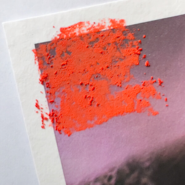
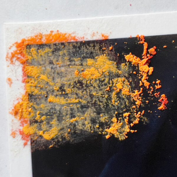
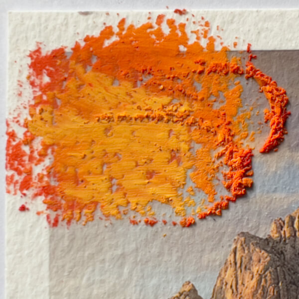
#2: Five Layers, All Schmincke (the Softest Pastel)
For experiment number two, I applied five pastel layers using only the softest pastel brand, Schmincke.
Takeaways
- Without any fixative, all five matte papers can accept 5 layers of Schminke soft pastels, but do better with less.
- Unsurprisingly, with the Torchon—the smoothest—it started to feel like it was getting saturated at the third layer, seemed mostly saturated at the fourth layer, and barely took a fifth application.
- Surprisingly, the William Turner—the roughest—also started to get saturated, but not until the fourth layer. The fifth layer behaved better than on the Torchon, yet started to smear.
- Only the Photo Rag seemed to take five layers of the Schmincke well.
- I might not want to use so many layers on much of the photo prints anyway! But it’s good to know the limits.
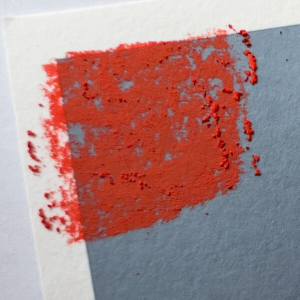
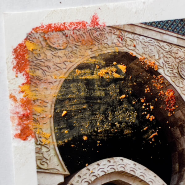
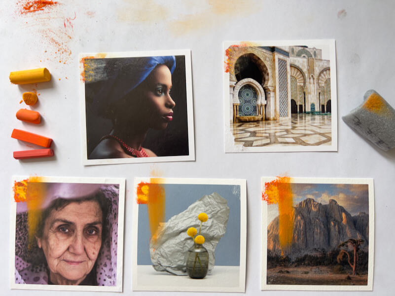
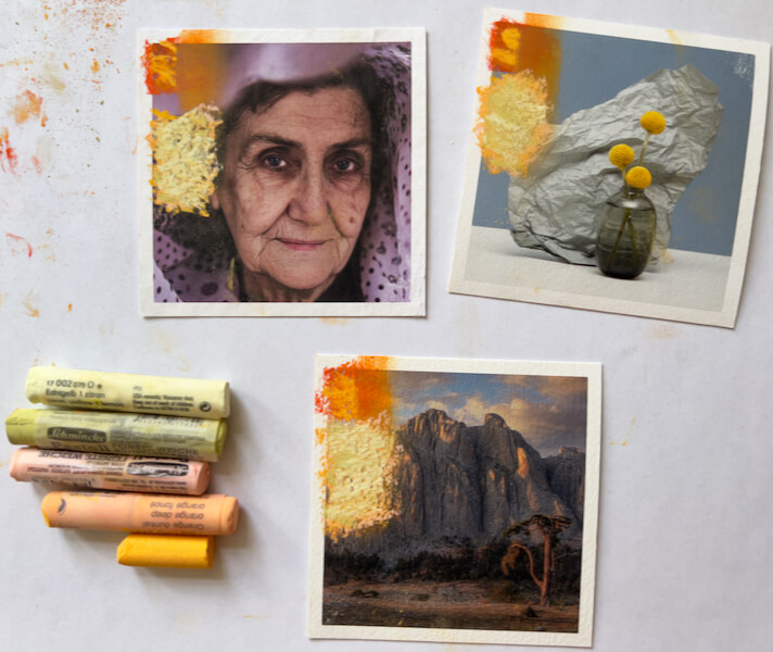
#3: Painting on Photos with Five Schmincke Pastel Layers, with Fixative
Knowing that the paper fibers could get easily saturated, I started by spraying the left side of each paper with Schmincke pastel fixative, and again spraying each pastel layer after it was applied.
The Baryta darkened slightly, after the fixative was applied. The Pearl also showed a very minor darkening.
After five layers of the softest pastel brand were applied with fixative, here were the final results:
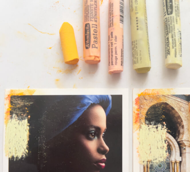
Takeaways
- Starting with fixative was probably not necessary with the matte papers, but it was essential to the layering of pastel colors on glossy and pearlescent prints.
- Spraying in between every layer made it possible to build five layers of the softest pastel, on every single Giclée print!
- The fixative slightly darkened the glossy and pearlescent papers, especially where they were already dark.
- No noticeable darkening happened on the matte papers.
Well, that’s it for today! I’ve already started the next round of experiments with painting on photos, but they will save for the next report.
Thanks for your time and attention, both are valuable. 🙏🏻
I invite you to view my photographs and paintings, and to learn more about me.
If you liked this post, you have options:
- Check out the art available in my shop!
- Buy me a coffee (I’d be so grateful!), or check out my Patreon (coming soon!).
- Sign up for my monthly newsletter, full of delicious tidbits.
- Follow my blog with RSS, using a feed reader like Feedly.
- Browse my other blog posts.
©Marlene Breitenstein. I welcome your inquiries about purchasing, licensing, or republishing my work. I take my intellectual property seriously. This post and its contents, unless otherwise noted, is owned by Marlene Breitenstein. It is not to be reproduced, copied, or published in derivative, without permission from the artist.